Mastering ‘Save to Web’ in Photoshop: Optimize Images for Your Website
- Date
Getting your images ready for the web is kind of a big deal. You want them to look good, sure, but you also don’t want them to make your website crawl like a snail. Photoshop has this old-school tool called ‘Save to Web’ that’s still pretty useful for this. It might not be the fanciest new feature, but it gives you a lot of control over how your images turn out online. Let’s figure out how to use it.
Key Takeaways
- The ‘Save to Web’ feature in Photoshop is a solid tool for making image files smaller and faster for websites.
- Before you save, resize your images to fit where they’ll be used online; don’t upload huge photos for small spots.
- Pick the right file type: JPEG for photos, PNG for things needing clear backgrounds, and GIF for simple animations.
- Use the preview options in ‘Save to Web’ to compare your original image with the optimized version and check quality.
- Adjust quality settings carefully to find the best mix between how good the image looks and how small the file size is.
Understanding the Save to Web Feature In Photoshop
So, you’ve got this great image in Photoshop, looking all crisp and ready to go. But is it really ready for the internet? That’s where the ‘Save to Web’ feature comes in. Think of it as your image’s personal trainer, getting it in shape for the digital world.
The Purpose of Save to Web for Online Media
When we talk about online media, we mean everything from your personal blog and company website to social media posts. Each place has its own rules and limits. The ‘Save to Web’ tool helps you get images ready so they look good and load fast everywhere. It’s important to know that some social media sites might compress your images even more after you upload them, so your picture might look a little different then. Still, starting with a well-prepared file is always the best way to go. The main goal is to make your images load quickly without making them look bad. It’s a balancing act, and ‘Save to Web’ gives you the controls to manage it. This feature is a legacy tool, meaning it’s been around for a while, but it still offers a really direct way to control how your images turn out for web use. It’s like a reliable tool in your toolbox – maybe not the newest, but it gets the job done effectively.
Here’s a quick look at what makes an image ready for the web:
- Resolution: Usually around 72 dots per inch (dpi) is fine for screens.
- Color Mode: RGB is the standard for digital displays.
- File Size: Smaller is generally better for faster loading.
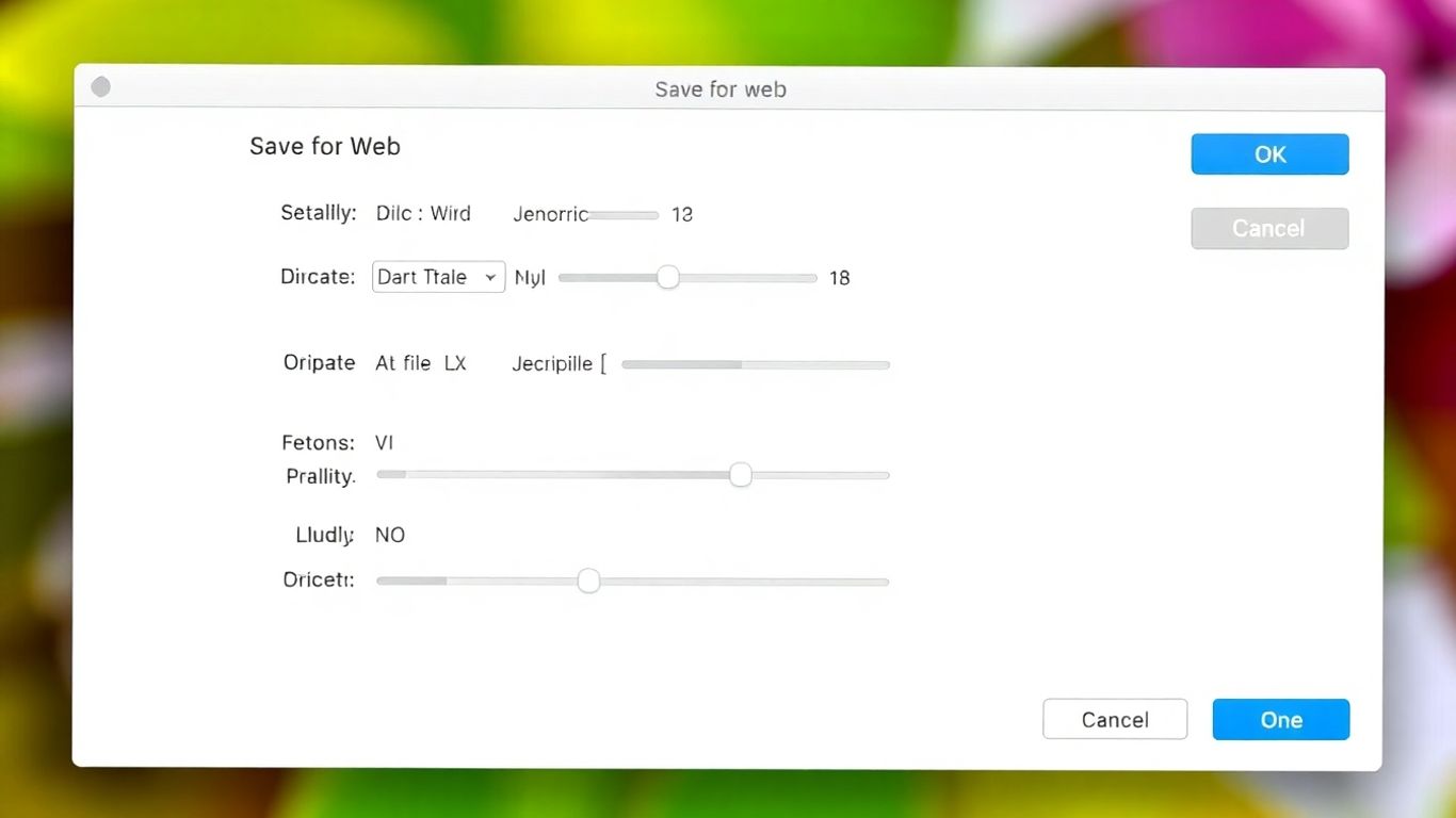
Accessing the Save to Web Dialog
Getting to the ‘Save to Web’ feature is pretty straightforward. Just go to File > Export > Save for Web (Legacy). In some older versions, it might just say ‘Save for Web’ or ‘Save for Web and Devices’. You can also use a handy keyboard shortcut: Alt + Command + Shift + S (or Option + Command + Shift + S on a Mac). It’s a good shortcut to remember if you plan on doing this a lot.
Navigating the Save to Web Interface
Once you open the dialog box, you’ll see a few different view options. The most useful one is probably the ‘2-Up’ tab. This is where the real work happens. It shows your original image on one side and the version you’re optimizing on the other, right next to each other. This lets you directly compare how your changes affect the image quality and the file size. You can also check out the ‘4-Up’ view to compare even more variations at once, which is great for testing different settings. The real power of the ‘2-Up’ view is the immediate feedback. As you tweak settings like quality or file format, you can instantly see the impact on your image. Is it still sharp enough? Is the file size much smaller? This comparison is key to finding that sweet spot between how good it looks and how fast it loads. You’ll also see estimated download times based on typical connection speeds, which is super helpful for understanding user experience. Making sure your images load quickly is a big part of making your website faster. Remember, the goal here is to make your image look as good as possible while keeping the file size as small as possible. It’s a balancing act, and the ‘Save to Web’ interface is designed to help you nail that balance. You can find more information on optimizing images for web use .
The interface lets you see your original image next to the optimized version, allowing for direct comparison of quality and file size changes. This visual feedback is key to making informed decisions about your export settings.
Preparing Your Images for Optimization

Before you even get to the ‘Save to Web’ dialog, there are a few things you should do to get your images ready. Think of it like prepping your ingredients before you start cooking; it just makes the whole process smoother and the final result better. The biggest culprit for slow websites is often oversized images, and nobody likes waiting around for a page to load, right? It’s bad for visitors and can even hurt your site’s standing in search results.
Resizing Images to Appropriate Dimensions
One of the most impactful steps you can take is to resize your images. You don’t want to upload a massive photo that’s only ever going to be displayed as a small thumbnail. That’s just wasted data and slow loading times. Figure out where the image will live on your website and size it accordingly. If it’s a banner image, it needs to be wider than a small product photo.
Understanding Pixel Dimensions for Web Use
When we’re talking about images for the web, we usually work with pixels. Pixels are the tiny little squares that make up the image on your screen. For most web use, a resolution of 72 pixels per inch (ppi) is perfectly fine. The key is to set the actual pixel dimensions (width and height) to match how the image will be displayed. For example, if your website’s content area is 800 pixels wide, you probably don’t need an image that’s 3000 pixels wide. You can check your image’s current pixel dimensions by going to Image > Image Size in Photoshop. Make sure ‘Constrain Proportions’ is checked so your image doesn’t get stretched or squashed when you change one dimension.
Setting Up Your Canvas for Web Export
Sometimes, you might need to crop an image to get the perfect composition or to fit a specific layout. The crop tool in Photoshop is your friend here. You can crop freely or set specific pixel dimensions or aspect ratios. If you know you need an image that’s exactly 600 pixels wide by 400 pixels tall, you can set that up in the crop tool options. This ensures your image is the right size and shape before you even start thinking about file formats and compression. It’s all about getting the image to fit its intended spot on the page without any extra, unnecessary space.
Getting your image dimensions right from the start saves a lot of hassle later on. It means you’re not asking the ‘Save to Web’ feature to do too much heavy lifting, and you’ll have more control over the final output. This preparation is key to optimizing images for the web.
Here’s a quick look at common pixel dimensions for different web uses:
- Full-width banner: 1920px wide or more (height varies)
- Content area image: 800px – 1200px wide (height varies)
- Thumbnail image: 150px – 300px wide (height varies)
- Social media post: Varies by platform, but often around 1080px wide.
Mastering File Formats with Save to Web
Alright, so you’ve got your image looking just right in Photoshop, but now it’s time to get it ready for the internet. This is where picking the right file format really matters. Think of it like choosing the right kind of container for something you’re shipping – you wouldn’t put a delicate vase in a flimsy envelope, right? The same idea applies to your web images.
Choosing JPEG for Photographic Content
For photos, pictures with lots of colors, or images that have smooth color transitions (like gradients), JPEG is usually your best bet. It’s designed to handle all those shades and tones really well. The key with JPEGs is finding that sweet spot with the quality setting. You can crank the quality way up, and your image will look amazing, but the file size will be pretty big. Or, you can lower the quality to make the file smaller, but then you might start seeing weird blocky bits or fuzziness, especially around edges. The ‘Save to Web’ tool lets you play with a quality slider, usually from 0 to 100. For most photos, a setting between 40 and 60 is a good starting point. It often gives you a good balance between looking sharp and keeping the file size manageable. You can also choose between ‘Baseline’ and ‘Progressive’ JPEGs. Progressive ones load in steps, showing a blurry version first and then getting clearer, which can make your page feel faster to load.
Leveraging PNG for Transparency Needs
Now, if you have an image where you need parts of it to be see-through – maybe a logo you want to place over a background color, or an icon – then PNG is your go-to format. It supports transparency, which means those parts of your image will just show whatever is behind them on the webpage. This is super useful for graphics that need to blend in. PNGs are also great for images with sharp lines and solid blocks of color, like logos or illustrations, because they tend to keep those edges nice and crisp without the blockiness you can sometimes get with JPEGs. There are a couple of PNG options, like PNG-8 and PNG-24. PNG-8 is similar to GIF in that it uses a limited color palette, which can make the file size smaller, but PNG-24 supports a much wider range of colors and better transparency. You’ll want to experiment to see which works best for your specific graphic.
When to Use GIF for Simple Graphics and Animations
GIFs are a bit of a classic. They’re really good for simple graphics that don’t have a ton of colors – think basic icons or line drawings. They also have the unique ability to handle animation . If you need a small, looping animation on your site, GIF is pretty much the standard. However, because GIFs are limited to only 256 colors, they’re not ideal for photographs or images with complex color gradients; the colors can end up looking pretty weird and posterized. When you’re using ‘Save to Web’ for GIFs, you can control things like how long each frame of the animation shows and whether it loops forever or just once. It’s a good idea to check out the different image formats to get a feel for what works best for different types of content.
Choosing the right format is a bit like picking the right tool for a specific job. Using a JPEG for a logo with sharp text might make it look fuzzy, and using a GIF for a detailed photo will make the colors look strange. Always think about what the image is and where it’s going before you decide how to save it.
Here’s a quick breakdown:
- JPEG: Best for photographs and images with lots of colors and gradients. Offers good compression but doesn’t support transparency.
- PNG: Ideal for graphics, logos, and images needing transparency. Preserves sharp details and supports a wide color range (PNG-24).
- GIF: Suitable for simple graphics with few colors and for creating animations. Limited color palette and supports basic transparency.
By understanding these formats and using the ‘Save to Web’ dialog to compare them, you can make sure your images look great and load fast on your website.
Balancing File Size and Image Quality
Okay, so you’ve got your image looking pretty good, but now comes the tricky part: making the file size small enough for the web without making it look like a pixelated mess. It’s all about finding that sweet spot. Nobody wants to wait forever for a page to load, but nobody wants to look at a blurry photo either.
Fine-Tuning JPEG Quality Settings
When you’re working with JPEGs, the ‘Quality’ slider is your best friend. It directly impacts how much detail Photoshop keeps. Lowering the quality discards more image data, making the file smaller, but it can also introduce blockiness or weird color banding, especially in smooth gradients. You’ll need to experiment to find the right balance for each image.
Here’s a general idea of what to expect:
- Quality 100: Best possible quality, but the largest file size. Usually overkill for the web.
- Quality 70-80: Very good quality, often indistinguishable from 100 for most viewers. A good starting point for photos.
- Quality 40-60: Decent quality, noticeably smaller file size. Works well for general web content where extreme detail isn’t critical.
- Quality 0-30: Smallest file sizes, but often with significant visual degradation. Use with caution.
Look at the bottom of the Save to Web dialog box. It shows you the estimated file size for your current settings. Play around with the quality slider and watch how that number changes. You can also use the preview options to see the visual difference.
Understanding Color Reduction for GIFs and PNG-8
GIFs and PNG-8 images work with a limited color palette, usually up to 256 colors. When you reduce the number of colors, you’re essentially telling Photoshop to pick the most important colors from your original image and use only those. This can drastically shrink file sizes, especially for images with lots of colors. However, if the original image has subtle color variations, reducing the palette can lead to noticeable banding or posterization. Photoshop tries its best to dither (mix) colors to smooth things out, but it’s not always perfect. For simple graphics with flat colors, this is usually fine. For photos, it’s generally not the best choice.
Evaluating File Size and Download Time Estimates
Photoshop’s Save to Web feature gives you a handy estimate of the file size and, based on that, an approximate download time for different connection speeds. This is super useful for putting things into perspective. A 500KB image might seem okay, but if the estimate shows it takes 10 seconds to load on a 56k modem, that’s a problem. Remember, many users are on mobile connections or slower Wi-Fi. Aiming for images under 100KB is a good general goal for most web content, though larger hero images might need to be a bit bigger. You can check out optimal Photoshop export settings for more ideas on keeping files small.
The goal is always to make the image load as fast as possible for the user, without sacrificing the visual appeal so much that it detracts from the content. Think about the context of the image on the page. Is it a tiny icon, a main feature image, or something in between? The answer will guide your optimization choices.
Utilizing Preview Options for Optimal Results
So, you’ve tweaked your settings in the ‘Save to Web’ dialog, but how do you know if you’ve actually made things better? That’s where the preview options come in. They’re like your personal quality control station, right inside Photoshop.
Comparing Original and Optimized Views
This is probably the most useful part of the whole preview system. When you click on the ‘2-Up’ tab, Photoshop shows you your original image on one side and the version you’re about to save on the other. It’s a direct, side-by-side comparison. You can immediately see if reducing the quality has made your photo look all blocky or if the colors have gone weird. This visual feedback is key to finding that sweet spot between file size and how good the image looks. You can also see the estimated file size and download time for the optimized version right there. It really helps you understand the impact of your choices before you commit.
Using the 2-Up and 4-Up Previews
While ‘2-Up’ is great for a direct comparison, the ‘4-Up’ view lets you compare even more variations at once. This is super handy if you’re trying out a few different quality settings or file types to see which one works best. You can click on each of the four preview windows and adjust the settings for that specific preview. It saves you from having to save multiple versions just to compare them. Remember, you can zoom in on any of these previews to check for pixelation or other visual glitches. It’s all about making an informed decision.
Assessing Visual Clarity and Artifacts
When you’re looking at the previews, what exactly should you be looking for? Well, first, check the overall sharpness. Has it degraded too much? Then, look closely for compression artifacts. These can show up as blocky squares, weird color banding, or fuzzy edges, especially in areas with smooth gradients or fine details. For JPEGs, a quality setting between 40 and 60 is often a good starting point, but you’ll need to adjust based on the specific image. You want to reduce the file size as much as possible without making the image look noticeably worse. It’s a bit of an art, but the previews make it much easier to get right. You can check out the Save for Web feature to get a better idea of how it works.
Ensuring Consistent Image Representation Online
So, you’ve spent time tweaking your images in Photoshop, getting them just right for the web. But how do you make sure they look the same for everyone, no matter what computer or phone they’re using? It’s all about sticking to some basic standards.
Adhering to sRGB Color Standards
Think of color profiles like a common language for colors. The web pretty much speaks sRGB. If your image is in a different color space, like Adobe RGB, it might look a bit off when displayed online. Using the sRGB color profile is your best bet for making sure your colors stay true across different devices. When you’re preparing to save, check your color settings. Most of the time, you’ll want to work in RGB mode, and sRGB is the standard for web output. This helps avoid those weird color shifts that can make a vibrant photo look dull or a subtle shade look completely wrong.
Testing Images Across Different Browsers
What looks perfect on your screen might show up differently in Chrome versus Firefox, or on a mobile device compared to a desktop. It’s a good idea to do a quick check. The ‘Save to Web’ dialog has preview options that can help, but nothing beats seeing it live. Upload a few test images to a staging area of your website or even just open them in different browsers on your own computer. Pay attention to how the colors look and if any compression artifacts have become more noticeable.
Considering Social Media Compression
This is a bit of a curveball. Even if you optimize your image perfectly using Photoshop’s ‘Save to Web’ feature, platforms like Facebook, Instagram, or Twitter often apply their own compression when you upload images. This means your carefully crafted image might get a little tweaked by the platform itself. While you can’t fully control this, starting with a well-optimized file is still the best approach. It gives you the best possible starting point before the platform does its thing. You can sometimes find guidelines on the social media sites themselves for recommended image sizes and formats, which can help minimize unwanted changes.
It’s easy to get lost in the technical details of optimization, but remember the main goal: a good user experience. Images that load fast and look good contribute directly to how visitors perceive your site. Don’t let inconsistent colors or slow load times be the reason someone clicks away.
Here’s a quick checklist to keep in mind:
- Color Profile: Always aim for sRGB for web images.
- File Format: Choose JPEG for photos, PNG for graphics with transparency, and GIF for simple animations.
- Dimensions: Resize images to fit their intended display area on your website.
- Quality Settings: Find the balance between file size and visual appeal using the ‘Save to Web’ preview.
By following these steps, you’re setting yourself up for images that look great and perform well online. You can save your work in Photoshop using various methods, but ‘Save to Web’ is specifically designed for this kind of optimization.
Wrapping Up Your Web Image Optimization
So, we’ve covered how to use Photoshop’s ‘Save for Web’ feature. It really comes down to finding that sweet spot where your image looks good online but also loads quickly. Remember to check your settings, especially the file type and quality, and use the preview options to see what works best. Getting this right means your website or blog will load faster and give visitors a better experience. Keep practicing with different images, and you’ll get a feel for what settings work best for your specific needs. It’s a pretty handy tool once you get the hang of it.
Frequently Asked Questions
What exactly is the ‘Save to Web’ feature in Photoshop?
Think of ‘Save to Web’ as a special tool in Photoshop that helps you make your pictures smaller and load faster when people visit your website. It’s like packing your photos super efficiently so they don’t take forever to show up online.
Why should I make my pictures smaller before using ‘Save to Web’?
It’s a smart move to resize your images first. For most websites, making the longest side of your picture around 1000 to 1200 pixels is usually plenty. This helps ‘Save to Web’ do an even better job of shrinking the file size without making your image look bad.
What’s the difference between the ‘Original’ and ‘Optimized’ views in ‘Save to Web’?
When you open ‘Save to Web’, you’ll often see two versions of your picture. The ‘Original’ is how it looks before you change anything. The ‘Optimized’ version shows you how it will look after you’ve adjusted the settings to make the file size smaller. This lets you compare them easily.
When is it best to use JPEG, PNG, or GIF for my images?
Use JPEG for photos because it handles many colors really well. Use PNG if you need parts of your image to be see-through (like a logo on a colored background). GIF is best for simple animations or graphics that don’t have many colors.
How do I find the right balance between file size and how good the image looks?
You can play with the ‘Quality’ setting in ‘Save to Web’. Making the quality lower makes the file smaller, but the image might look a bit worse. Making the quality higher makes the image look better, but the file gets bigger. Keep tweaking it until you find a good mix that works for you.
Why is it important to check my images on different web browsers?
Websites can look a little different depending on the browser people use, like Chrome, Firefox, or Safari. Testing your images on different browsers makes sure they look good and load correctly for everyone, no matter what browser they’re using.