Mastering Save for Web in Photoshop: A Comprehensive Guide
- Date
Making your images look good online is super important, right? Like, you want your photos and graphics to load fast and not look all blocky or weird. Photoshop has this tool, the ‘Save for Web’ feature, that’s been around for ages. It’s basically your go-to for getting those images just right for websites and stuff. We’ll walk through how to use it so your pictures don’t slow down your site or look terrible.
Key Takeaways
- The Save for Web feature in Photoshop is a legacy tool designed to optimize images for online use, balancing file size and visual quality.
- Before using Save for Web, it’s a good idea to resize your images to a suitable pixel dimension, often around 1000-1200 pixels on the longest side.
- The Save for Web dialog allows you to compare your original image with the optimized version side-by-side to make informed adjustments.
- Choosing the correct file format (JPEG for photos, PNG for transparency, GIF for animations) is vital for web optimization.
- Fine-tuning settings like quality and previewing results helps achieve the best balance between file size and image clarity for different web applications.
Understanding the Save for Web Feature
So, you’ve got this awesome image in Photoshop, looking sharp and ready for anything. But wait, is it ready for the internet? That’s where the ‘Save for Web’ feature comes in. Think of it as your image’s personal trainer, getting it in shape for the digital world.
Purpose of Save for Web
Basically, websites and online content need images that load fast. Big, unoptimized files can make a page crawl, and nobody likes waiting around. The ‘Save for Web’ tool is designed to shrink those file sizes without making your pictures look like they were drawn with crayons. It’s all about finding that sweet spot between how good the image looks and how quickly it can be delivered to someone’s screen.
Legacy Feature in Photoshop
Now, you might see ‘Save for Web’ referred to as a ‘legacy’ feature. What that means is it’s been around for a while, a tried-and-true method that Adobe has kept in Photoshop. While there are newer export options, ‘Save for Web’ still offers a really direct way to control image output specifically for web use. It’s like an old reliable tool in your toolbox – maybe not the newest model, but it gets the job done effectively.
Optimizing for Web-Based Media
When we talk about web-based media, we’re talking about everything from your personal blog and company website to social media posts. Each platform has its own quirks and limits. ‘Save for Web’ helps you prepare images that will look good and perform well across these different online spaces. It’s important to remember that some social media sites might do their own compression on top of what you do, so your image might look a little different once it’s uploaded. Still, starting with a well-optimized file is always the best approach.
Here’s a quick rundown of what makes an image web-ready:
- Resolution: Usually around 72 dots per inch (dpi) is fine for screens.
- Color Mode: RGB is the standard for digital displays.
- File Size: Smaller is generally better for faster loading.
The goal is to make your images load quickly without sacrificing too much visual appeal. It’s a balancing act, and ‘Save for Web’ gives you the controls to manage it.
Preparing Your Images for Optimization
Before you even think about hitting ‘Save for Web’, it’s a good idea to get your images ready. Think of it like prepping ingredients before you start cooking – it makes the whole process smoother and the final result better.
Resizing Images Before Saving
One of the biggest factors affecting how quickly a webpage loads is the size of the images. Large image files can really slow things down, which is bad for user experience and can even hurt your site’s search engine ranking. So, before you use Save for Web, you should resize your images to dimensions that are appropriate for their intended use on your website. You don’t want to upload a massive photo that’s only going to be displayed as a small thumbnail.
Recommended Pixel Dimensions
What are the right dimensions, though? It really depends on where the image will be used. For general website content, like blog post images or product photos that aren’t meant to be zoomed in on, a width of around 1000 to 1200 pixels is often plenty. This gives you enough detail without creating an unnecessarily large file. If you’re designing something like a banner or a hero image that takes up a significant portion of the screen, you might need larger dimensions, but always consider the final display size.
Here’s a quick look at common scenarios:
- Thumbnails/Small Icons: 100-150 pixels wide
- Blog Post Images: 800-1200 pixels wide
- Hero/Banner Images: 1600-2000 pixels wide (consider responsive design here)
Remember to keep the aspect ratio locked when resizing if you don’t want the image to get stretched or squashed. You can usually find a little chain link icon next to the width and height fields in Photoshop’s Image Size dialog to do this.
Managing File Size
Beyond just the pixel dimensions, you also need to think about the actual file size. Even a reasonably sized image can be too large if it’s not optimized correctly. The goal is to find a balance. You want the file size to be as small as possible for fast loading, but not so small that the image quality suffers too much. This is where the ‘Save for Web’ feature really shines, allowing you to preview different optimization settings and see the impact on both file size and visual quality side-by-side. Getting your images ready for the web is a key step in optimizing your e-commerce site .
It’s always a good practice to have a general idea of your target file size before you start optimizing. For many web images, aiming for under 100KB is a good starting point, though this can vary greatly depending on the image complexity and intended use.
Navigating the Save for Web Interface
Alright, so you’ve got your image ready and you’re about to dive into the Save for Web dialog. It might look a little intimidating at first, but it’s actually pretty straightforward once you know what you’re looking at. Think of it as your control center for making images web-friendly.
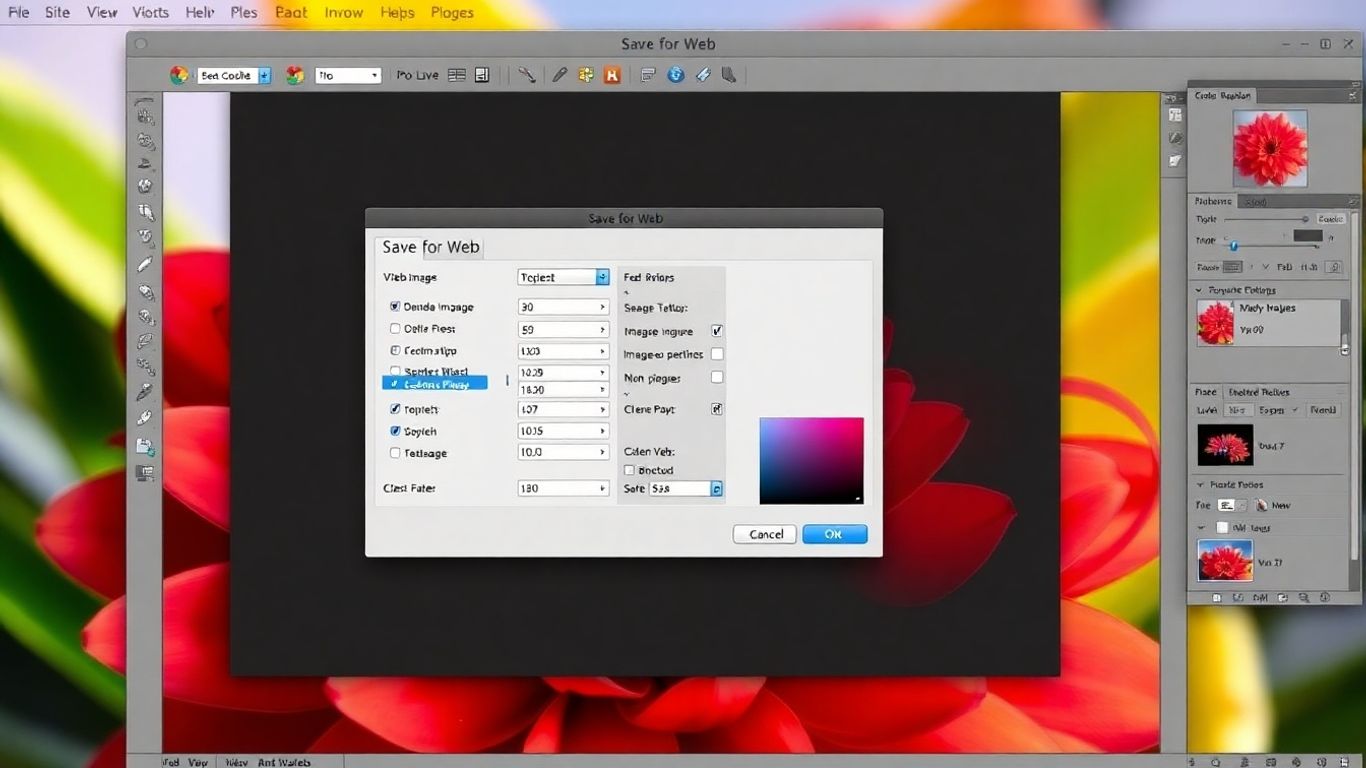
Accessing the Save for Web Dialog
Getting to the Save for Web feature is simple. Just go to File > Export > Save for Web (Legacy) . Some older versions might just say Save for Web or Save for Web and Devices . You can also use the handy keyboard shortcut: Alt + Command + Shift + S (or Option + Command + Shift + S on a Mac). It’s a good shortcut to memorize if you plan on doing this often.
Understanding the 2-Up View
Once you open the dialog, you’ll see a few different view options, but the most useful one is probably the 2-Up tab. This is where the magic happens. It shows you your original image on one side and the optimized version on the other, side-by-side. This lets you directly compare how your changes affect the image quality and file size. You can also check out the 4-Up view to compare even more variations at once, which is great for testing different settings.
Comparing Original and Optimized Images
The real power of the 2-Up view is the immediate feedback. As you tweak settings like quality or file format, you can instantly see the impact on your image. Is it still sharp enough? Is the file size drastically reduced? This comparison is key to finding that sweet spot between visual appeal and fast loading times. You’ll also see estimated download times based on typical connection speeds, which is super helpful for understanding user experience. Making sure your images load quickly is a big part of enhancing your website’s speed .
Remember, the goal here is to make your image look as good as possible while keeping the file size as small as possible. It’s a balancing act, and the Save for Web interface is designed to help you nail that balance.
Here’s a quick rundown of what you’ll be looking at:
- Original: Your starting point, untouched.
- Optimized: The version with your chosen settings applied.
- File Size: Shown below the optimized image, this tells you how big the file will be.
- Download Time: An estimate of how long it will take to load on different internet speeds.
By using these views and paying attention to the file size and download time estimates, you can make informed decisions about your image optimization.
Choosing the Right File Format
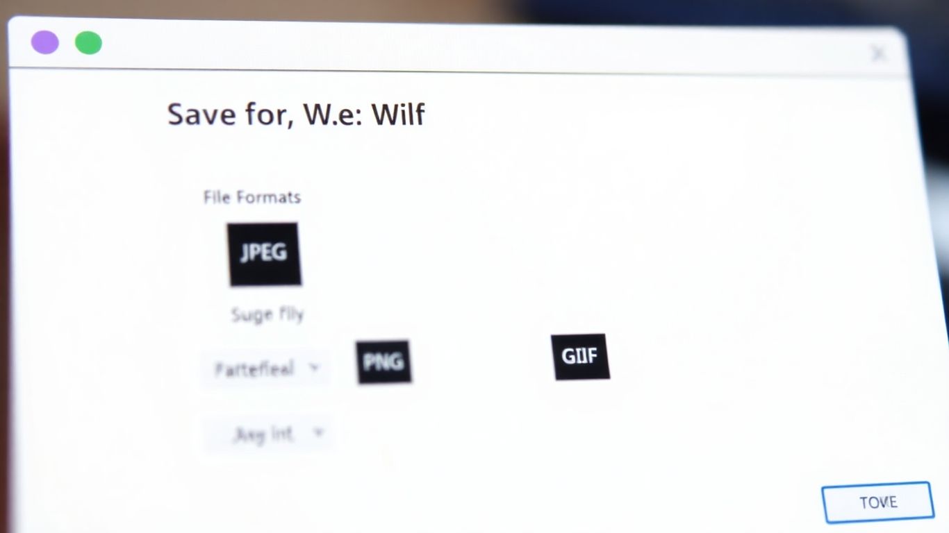
So, you’ve got your image all prepped and ready to go. Now comes the big question: what file format should you actually use? It really depends on what kind of image it is and what you want it to do on your website.
JPEG for Photographs
For photos, like those vacation shots or product pictures, JPEG is usually the way to go. It’s great at handling lots of colors and subtle shading, which is exactly what photos have. JPEGs use a lossy compression method , meaning they throw away some data to make the file size smaller. This is why you can adjust the quality setting – lower quality means a smaller file but might make the image look a bit blocky or blurry. You’ll want to find that sweet spot where the file is small enough for fast loading, but the image still looks good. A quality setting between 40 and 60 is often a good starting point for web photos.
PNG for Graphics and Transparency
If you have graphics with sharp lines, text, or areas of solid color, like logos or icons, PNG is often a better choice. PNGs support transparency, which means you can have parts of your image be see-through. This is super handy for logos that need to sit on top of different backgrounds without a white box around them. There are two main types: PNG-8 and PNG-24. PNG-8 is good for simpler graphics with fewer colors and smaller file sizes, while PNG-24 offers better color depth and transparency but results in larger files. For most web graphics needing transparency, PNG-24 is the standard.
GIF for Animations
What about those little animated images you see online? Those are almost always GIFs. The Graphics Interchange Format (GIF) supports animation by displaying a sequence of frames. It’s also good for simple graphics with limited colors, similar to PNG-8. However, GIFs have a color limitation of only 256 colors, which isn’t ideal for photographs. If you need animation, GIF is your format, but for static images, especially photos, you’ll want to stick with JPEG or PNG. You can also use the Save for Web feature to create these animations, controlling the frame delay and looping options.
Choosing the right format is like picking the right tool for a job. Using a JPEG for a logo with sharp text might make it look fuzzy, and using a GIF for a detailed photo will make the colors look weird. Think about the image’s content and its intended use before you hit save.
When you’re working in the Save for Web dialog, you can easily compare different formats and settings side-by-side. This lets you see how changing the file type or quality affects both the visual appearance and the estimated file size. It’s a good idea to experiment a bit to see what works best for your specific image. Remember, the goal is to make your images look great without slowing down your website. You can check out the default Photoshop format here if you’re ever unsure where to start with your original files.
Fine-Tuning Optimization Settings
Once you’ve got your image ready and you’re in the Save for Web dialog, it’s time to really dial in those settings. This is where you balance how good the image looks with how fast it loads.
Adjusting Quality Settings
This is probably the most important slider you’ll play with. For JPEGs, you’ll see a ‘Quality’ slider. Lowering this value will make the file size smaller, but it can also make the image look a bit blocky or blurry. Raising it makes the image look sharper, but the file size balloons up. It’s a trade-off, for sure.
- JPEG Quality: A setting between 40 and 60 is often a good starting point. It usually gives you a decent balance.
- Progressive vs. Baseline: Progressive JPEGs load in stages, showing a blurry version first and then sharpening up. Baseline JPEGs load all at once. For most sites, progressive can feel faster to the user.
- Color Table/Lossy: For GIFs and PNG-8, you’ll see options related to color reduction. ‘Lossy’ compression can reduce file size further but might introduce artifacts.
Balancing File Size and Image Quality
Finding that sweet spot is key. You don’t want an image that takes ages to load, but you also don’t want one that looks terrible. Think about where the image will be used. A small thumbnail might not need the highest quality, but a large banner image probably does.
Here’s a quick way to think about it:
- Small Files: Good for icons, small buttons, or images that are viewed quickly.
- Medium Files: Suitable for general website photos where a bit of compression is acceptable.
- Larger Files: Best for hero images or photos where detail is really important, but still keep an eye on the total file size.
Remember that even small differences in file size can add up across an entire website. Optimizing every image thoughtfully contributes to a better overall user experience.
Previewing Results
Don’t just guess! The Save for Web dialog lets you see a preview of your image with the current settings. You can even compare different settings side-by-side using the ‘2-Up’ or ‘4-Up’ views. This is super helpful for making informed decisions. You can also see estimated download times based on different connection speeds, which really helps put the file size into perspective. It’s a good idea to check out how your image looks at different quality levels before committing to a save.
Best Practices for Save for Web
Alright, so you’ve got your image looking just right in Photoshop, and you’re ready to export it for your website. But wait, there are a few things to keep in mind to make sure it actually looks good and loads fast once it’s online. It’s not just about hitting ‘Save’.
Consistent Color Representation
This is a big one. You want your image to look the same on your screen as it does on someone else’s, right? To help with that, make sure your Photoshop color settings are dialed in for web use. Most of the time, this means sticking with the sRGB color profile. It’s pretty much the standard for web stuff, so it helps avoid those weird color shifts you sometimes see. Think of it like using a common language so everyone understands.
Maintaining Image Clarity
We all want sharp images, but sometimes making a file smaller means losing a bit of that crispness. It’s a balancing act. When you’re in the Save for Web dialog, keep an eye on the preview. If you’re using JPEG, try to find that sweet spot for the quality setting – often somewhere between 40 and 60 works well. You don’t want it looking all blocky or muddy, but you also don’t want a massive file size. It’s about getting the best visual result for the smallest possible file.
Here’s a quick look at common quality settings for JPEGs:
| Quality Setting | Visual Appearance | File Size Impact |
|---|---|---|
| 100 | Best quality, largest file | High |
| 70-80 | Very good quality, moderate file | Medium |
| 40-60 | Good quality, smaller file | Low |
| 0-30 | Poor quality, smallest file | Very Low |
Testing Across Browsers
What looks good on your computer might not look so great on a phone or a different browser. Photoshop’s Save for Web feature actually lets you preview how your image will look. Use the ‘2-Up’ view to compare your original with the optimized version. You can even adjust settings and see the changes instantly. It’s a good idea to test your website on different devices and browsers to catch any issues before your visitors do. Making sure your images load quickly is key for a good user experience, so optimizing images for the web is a must.
Remember that social media sites might re-compress your images after you upload them. So, even if you optimize perfectly in Photoshop, the final look might change a bit depending on the platform.
Wrapping Up Your Web Image Optimization
So, we’ve gone through how to use Photoshop’s Save for Web feature. It’s really about finding that sweet spot between how good your image looks and how fast it loads online. Remember to check your settings, especially the quality and file type, and use the preview options to see what works best. Getting this right means your website or blog will load quicker and give visitors a better experience. Keep practicing with different images, and you’ll get a feel for what settings work best for your specific needs. It’s a pretty handy tool once you get the hang of it.
Frequently Asked Questions
What is the ‘Save for Web’ feature in Photoshop?
The ‘Save for Web’ feature is a special tool in Photoshop that helps you make your images smaller and faster for websites. It’s like packing your photos efficiently so they load quickly when people visit your site.
Why should I resize my images before using ‘Save for Web’?
It’s a good idea to make your images a reasonable size first. For most websites, making the longest side of your image around 1000 to 1200 pixels is usually enough. This helps ‘Save for Web’ do an even better job of making the file small without losing too much quality.
What’s the difference between the ‘Original’ and ‘Optimized’ views in ‘Save for Web’?
The ‘Save for Web’ window often shows two versions of your image. The ‘Original’ is how your image looks before you make any changes. The ‘Optimized’ version shows how it will look after you’ve adjusted the settings to make the file size smaller.
When should I use JPEG, PNG, or GIF for my web images?
Use JPEG for photos because it handles lots of colors well. Use PNG if you need parts of your image to be see-through (transparent). GIF is best for simple animations or images with only a few colors.
How do I find the best balance between file size and image quality?
You can play with the ‘Quality’ slider in ‘Save for Web’. Lowering the quality makes the file smaller but can make the image look a bit worse. Raising it makes the image look better but increases the file size. Keep adjusting until you find a good mix.
Why is it important to test my images on different browsers?
Websites can look slightly different depending on the web browser someone is using (like Chrome, Firefox, or Safari). Testing ensures your optimized images look good and load correctly for everyone, no matter which browser they use.