Designing Your Next Masterpiece: A Guide to Creative Market Logo Inspiration
- Date
So, you need to design a logo, huh? It can feel like staring at a blank wall sometimes, especially when you want it to be really good. You want something that pops, something that says exactly what your brand is about without a single word. Finding that spark for a creative market logo can be tricky. We’ve all seen those amazing logos out there and wondered, ‘How did they even come up with that?’ Well, it’s not magic, but it does take some thought and looking in the right places. This guide is here to help you find that inspiration and turn it into a logo you’ll be proud of.
Key Takeaways
- Look at what successful brands in your field are doing for logo ideas, but don’t just copy them. See what works and why.
- Online design communities and art from different cultures can offer fresh, unexpected inspiration for your creative market logo.
- Try simple techniques like word association and sketching to get your ideas flowing before you jump into design software.
- A good logo should be simple, easy to remember, and clearly show what your brand is all about. It needs to work everywhere, too.
- Think about your brand’s personality and who you’re trying to reach when choosing colors, shapes, and fonts for your logo.
Unearthing Creative Market Logo Inspiration
Starting with a blank page can feel a bit overwhelming, right? Even for folks who do this for a living. If you’re feeling stuck, don’t worry. There are tons of places to look for ideas that can get your creative juices flowing.
Exploring Industry Leaders for Logo Ideas
One of the first stops should be looking at what other brands in your field are doing. What kind of logos do they have? Are they all using similar colors or fonts? For example, you might notice that finance companies often go for clean, strong text, while places that do creative work tend to play around more with shapes and colors. It’s not about copying, but about understanding the visual language of your industry. You can get a feel for this by looking at how different companies present themselves online, like checking out how Santander’s brand has evolved over time.
Tapping into Design Communities for Trends
Online communities are goldmines for seeing what’s new and what’s popular. Sites like Behance, Dribbble, and even Pinterest are packed with work from designers all over the world. You can see how others are tackling similar projects and get a sense of current trends. It’s a great way to spot fresh ideas and see different approaches to logo design.
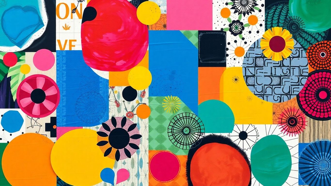
Drawing from Art and Culture for Unique Elements
Don’t limit yourself to just what’s happening in your industry. Inspiration can come from anywhere. Think about art galleries, street art, old signs, or even patterns you see in nature. These sources can give you ideas for unique shapes, color combinations, or even font styles that you wouldn’t find by just looking at competitor logos. Sometimes, the most unexpected places spark the best ideas.
Sometimes, the most ordinary things can hold the most extraordinary inspiration if you just look at them a little differently. Keep your eyes open.
Here are a few things to keep in mind when you’re looking around:
- Color Palettes: Notice the combinations of colors used. Are they bright and bold, or soft and muted?
- Typography: Pay attention to the fonts. Are they simple and clean, or decorative and unique?
- Symbolism: What kind of shapes or icons are being used, and what might they represent?
- Overall Feel: Does the logo feel modern, classic, playful, or serious?
Techniques for Crafting Distinctive Logos
So, you’ve got a bunch of ideas swirling around, maybe from looking at what other folks are doing or just from general life. That’s great! But how do you actually turn those sparks into a logo that’s, you know, yours ? It’s not just about picking a cool font and calling it a day. We need to get a bit more hands-on.
Word Association for Visual Translation
This is where you really dig into what your brand is all about. Grab a notebook, or open up a doc, and just start writing down words that describe your business, your mission, what you do, who you serve. Don’t filter yourself here. Think adjectives, nouns, verbs – anything that comes to mind. Once you have a solid list, start looking for visual connections. If "innovation" is on your list, what does that look like? Is it a lightbulb? A rocket? A circuit board? Or maybe it’s something more abstract, like a sharp, upward-pointing arrow. The goal is to translate abstract concepts into concrete visual elements. It’s a bit like solving a puzzle, but way more fun.
The Power of Freehand Sketching
Before you even think about opening up design software, get your hands dirty with some sketching. Seriously, just grab a pen and paper. This is where the magic often happens. You can churn out dozens of rough ideas in minutes, playing with different shapes, layouts, and compositions. Software can sometimes make us too precise too early, which can stifle creativity. Sketching lets you be messy, experiment freely, and often stumble upon unexpected solutions. Don’t worry about making it look perfect; focus on getting the ideas out. You can always refine them later. It’s about exploring possibilities without the pressure of digital perfection.
Leveraging Negative Space Creatively
Negative space, that’s the empty area around and between the elements of your design, is often overlooked but can be a total game-changer. It’s like the silence in music – it gives the notes meaning. When used well, negative space can add a second layer of meaning to your logo, making it more clever and memorable. Think about the classic FedEx logo; the arrow hidden between the ‘E’ and ‘x’ is a perfect example of this. It subtly communicates speed and precision. Playing with negative space can make your logo feel more dynamic and engaging, giving people something extra to discover. It’s a smart way to add depth without cluttering the design. It’s a great way to find your niche as an online entrepreneur [b199].
Here are a few things to keep in mind when playing with negative space:
- Look for hidden shapes: Can you form a letter, an object, or a symbol using the space between other elements?
- Consider balance: Ensure the negative space doesn’t overpower the main elements of your logo.
- Test for clarity: The hidden meaning should be discoverable, not so obscure that it’s missed entirely.
Sometimes the simplest ideas are the hardest to find. Don’t be afraid to step away from the screen and look at things from a different angle. The solution might be hiding in plain sight, just waiting for you to notice it.
Key Elements of Memorable Logo Design
So, you’re thinking about what makes a logo stick in people’s minds, right? It’s not just about looking pretty; there are some real building blocks that make a logo work hard for a brand. A truly memorable logo is a blend of simplicity, relevance, and distinctiveness. Think about it – when you see a familiar shape or symbol, you instantly know the brand. That’s the goal.
Simplicity and Recognizability
This is probably the most talked-about element, and for good reason. Overly complicated designs get lost. We’re talking about logos that are easy to spot, even from a distance or when shrunk down to fit on a tiny app icon. It’s about stripping away anything unnecessary. A clean, straightforward design is easier for people to recall and process. It’s like a good handshake; it gets the point across without a lot of fuss.
Brand Identity Representation
Your logo needs to tell a story about what your brand is all about. Does your company focus on nature? Maybe some organic shapes or earthy colors would fit. Are you a tech startup? Perhaps something more geometric and modern makes sense. It’s about making sure the visual elements align with your brand’s core values and what you offer. This connection helps people understand and relate to your brand on a deeper level. For example, a stationery brand might use subtle colors and clean lines to convey quality, as seen in some minimalist stationery logos .
Originality and Memorability
In a crowded marketplace, standing out is key. A logo that’s too similar to others won’t make a lasting impression. You want something unique that grabs attention and is easy to remember. This doesn’t mean it has to be bizarre, but it should have a distinctive quality. Think about how a clever use of negative space or a unique typographic treatment can make a logo unforgettable.
Timelessness and Versatility
Trends come and go, and a logo that’s too trendy can look dated pretty quickly. The aim is to create something that feels relevant now and will still look good in ten, twenty, or even fifty years. This means avoiding fads and focusing on strong, enduring design principles. Alongside timelessness, versatility is super important. Your logo needs to work everywhere: on a giant billboard, a small business card, a website header, or even embroidered on a hat. It should look good in black and white just as it does in full color, and it needs to scale without losing detail. Testing your logo across different applications is a smart move.
A logo is more than just a pretty picture; it’s the visual cornerstone of your brand. It needs to be instantly recognizable, clearly represent what your business stands for, and be adaptable enough to appear consistently across all your marketing materials. When these elements come together, you create a powerful symbol that builds trust and recognition over time.
Here are some qualities to aim for:
- Simplicity: Easy to see and recall.
- Relevance: Matches brand values and industry.
- Memorability: Unique and leaves an impression.
- Timelessness: Avoids fleeting trends.
- Versatility: Works across all sizes and mediums.
Defining Your Brand’s Visual Identity
Before you even start sketching, you really need to nail down what your brand is all about. Think of it like getting to know someone before you try to paint their portrait. What are their core beliefs? What makes them tick? Your brand has a personality too, and your logo needs to be its visual handshake with the world.
Brainstorming Brand Adjectives and Values
This is where you get to be a bit introspective. Grab a notebook, or maybe a whiteboard, and just start listing words that describe your brand. Are you playful? Serious? Innovative? Reliable? Don’t hold back. Think about the feeling you want people to have when they interact with your business. Are you aiming for trust, excitement, or maybe a sense of calm?
Here are some questions to get you started:
- What three words best describe your brand’s personality?
- What core values drive your business decisions?
- What kind of emotional response do you want your brand to evoke?
- If your brand were a person, what would they be like?
Once you have a good list, try to group similar words. This helps you see the bigger picture and identify the most important traits. For example, words like ‘dependable,’ ‘trustworthy,’ and ‘stable’ might all point to a core value of reliability.
Understanding Your Target Audience
Who are you trying to reach? Seriously, who are these people? Knowing your audience is super important because your logo needs to speak their language. A logo designed for teenagers is going to look very different from one aimed at corporate executives, right? Think about their age, interests, lifestyle, and even their sense of humor. What kind of visuals do they respond to? What colors do they like? Getting a handle on this helps you make design choices that will actually connect with the people you want to attract. It’s all about making them feel seen and understood. You can check out some examples of how different brands connect with their audience on Creative Market .
Color Psychology in Logo Design
Colors aren’t just pretty; they carry a lot of meaning. Different colors can trigger different emotions and associations. For instance, blue often suggests trust and stability, while red can convey passion or urgency. Yellow might feel cheerful, and green can relate to nature or growth.
It’s not just about picking your favorite color. You need to think about what your chosen colors say about your brand. Are they aligned with the adjectives and values you brainstormed earlier?
Here’s a quick look at some common color associations:
| Color | Common Associations |
|---|---|
| Blue | Trust, stability, professionalism, calm |
| Red | Passion, energy, excitement, urgency, boldness |
| Yellow | Optimism, happiness, warmth, creativity, caution |
| Green | Nature, growth, health, wealth, harmony, freshness |
| Orange | Enthusiasm, creativity, friendliness, playfulness |
| Purple | Luxury, royalty, wisdom, creativity, spirituality |
| Black | Sophistication, power, elegance, mystery, formality |
| White | Purity, simplicity, cleanliness, honesty, minimalism |
Choosing the right colors is like picking the perfect outfit for a first impression. It sets the tone and communicates a lot before anyone even says a word. Make sure your color choices support your brand’s overall message and personality.
Exploring Diverse Logo Styles
When you’re designing a logo, it’s not just about picking a pretty picture. The style you choose says a lot about the brand itself. Think about it: a super minimalist logo for a tech startup feels different than a bold, colorful one for a children’s toy company. There are tons of ways to go, and understanding these different approaches can really help you zero in on what fits best.
Minimalist vs. Bold Design Approaches
Minimalism is all about stripping things down to their absolute essentials. We’re talking clean lines, simple shapes, and often a limited color palette. It’s about clarity and making a statement without a lot of fuss. Think of brands that want to appear sophisticated, modern, or efficient. On the flip side, bold designs go for impact. They use strong colors, dynamic shapes, and sometimes even complex illustrations to grab attention. These are great for brands that want to feel energetic, playful, or stand out in a crowded market. It’s a balancing act, really. You want to be memorable, but not so busy that people can’t figure out what you do.
Here’s a quick look at how these styles can play out:
| Style | Key Characteristics | Best For |
|---|---|---|
| Minimalist | Clean lines, simple shapes, limited colors, white space | Tech, finance, luxury, professional services |
| Bold | Strong colors, dynamic shapes, high contrast, energy | Entertainment, retail, youth brands, creative agencies |
Abstract and Symbolic Logo Concepts
Sometimes, a logo doesn’t need to be a literal representation of a product or service. Abstract and symbolic logos use shapes, colors, and forms to convey a feeling, an idea, or a value. For instance, interlocking shapes might suggest unity and collaboration, like in the AKA logo example. Or a stylized hummingbird could represent agility and speed, as seen with Colibrian. These types of logos often require a bit more thought from the viewer, but they can create a deeper, more emotional connection with the audience. They allow for a lot of creative freedom and can be really effective for brands that want to communicate something beyond the obvious. It’s about creating a visual metaphor that sticks.
Abstract elements allow for deeper storytelling, giving brands flexibility to express multiple facets of their identity. This can be particularly useful for service-based businesses or those with a complex mission.
Typography-Driven Logo Designs
Don’t underestimate the power of letters! Typography-driven logos focus on the font itself as the primary design element. This can range from using a unique, custom-designed typeface to creatively arranging standard fonts. The goal is to make the brand name itself visually interesting and memorable. Think about how different fonts evoke different feelings – a sleek sans-serif might feel modern and clean, while a more decorative serif could feel traditional or elegant. Sometimes, designers will play with letterforms, creating unique ligatures or custom characters. It’s a really direct way to communicate a brand’s personality, and it can be incredibly versatile. For a lot of businesses, especially those with strong names, a well-executed typographic logo is all they need to make a lasting impression. You can find some great examples of creative logo ideas that showcase this approach. Many logo ideas exist that rely heavily on font choice and arrangement.
Inspiration from Award-Winning Logos
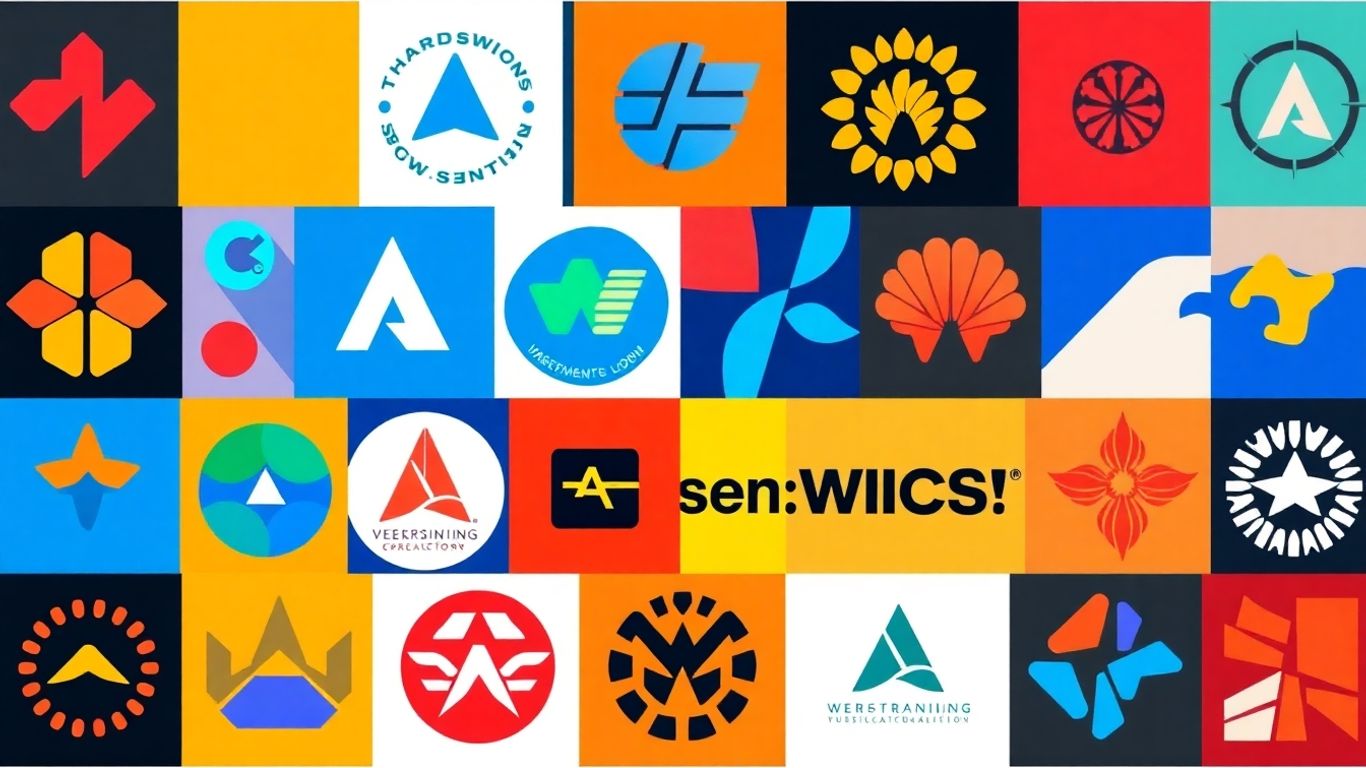
Looking at logos that have already made a splash can really get your creative juices flowing. It’s like peeking at the best work in a gallery to figure out what makes art great. These award-winners aren’t just pretty pictures; they often tell a story or represent a brand’s core values in a really smart way. Studying these designs can reveal patterns and techniques that make a logo stick in people’s minds.
Analyzing Minimalist Stationery Logos
Think about brands that sell things like paper, pens, or craft supplies. Their logos often need to feel clean, sophisticated, and maybe a little bit elegant. Take the Papeterie Haute-Ville logo, for example. It uses overlapping paper shapes with nice, soft colors. It’s not shouting for attention, but it feels high-quality and professional. This kind of design works well because it suggests the brand is all about precision and good materials. It’s a subtle nod to the products without being too literal. For stationery, keeping things simple and using a calm color palette often works wonders.
Gradient-Rich Designs for Creative Agencies
Creative agencies, on the other hand, often go for logos that feel energetic and modern. The Star Creative logo is a good example here. It uses a bright gradient, like a starburst, which really pops. This kind of design screams "innovation" and "creativity." Gradients can make a logo feel dynamic and visually interesting, which is perfect for a company that wants to show it’s on the cutting edge. It’s a way to add a lot of visual punch without needing complex shapes. These designs often aim to be memorable and stand out from the crowd.
Abstract Symbolism in Logo Creation
Sometimes, the most interesting logos don’t show you exactly what the company does. They use abstract shapes or symbols to hint at the brand’s personality or mission. The Design Wade logo, with its floating hand and fish, is a bit quirky but it suggests artistic flow and depth. It’s a way to create a deeper meaning that people can connect with on an emotional level. These abstract elements can be really flexible, allowing a brand to express different sides of itself over time. It’s about creating a feeling or an idea rather than just a picture. You can find more ideas for building a strong brand identity by looking at how these award-winners communicate.
When you look at award-winning logos, pay attention to how they use color, shape, and typography. Often, the simplest designs have the most impact because they are easy to remember and recognize. Think about what feeling or message the logo is trying to send and how it achieves that with minimal elements.
Putting It All Together
So, we’ve looked at a bunch of cool logos and talked about how to find your own inspiration, whether that’s from other brands, art, or just doodling on a napkin. Remember, a logo is more than just a pretty picture; it’s the face of your brand. It needs to feel right for what you do and who you’re trying to reach. Don’t be afraid to play around with ideas, sketch things out, and maybe even ask a friend what they think. The goal is to create something that feels authentic and sticks with people. Now go out there and design something awesome!
Frequently Asked Questions
Where can I find ideas for my logo?
You can find logo ideas by looking at what successful companies in your field are doing, checking out what designers are sharing online in communities like Dribbble or Behance, and even getting inspired by art, culture, or things you see every day. Inspiration is everywhere!
What are some good ways to come up with unique logo designs?
To create a logo that stands out, try writing down words related to your brand and then thinking about how to show those words as pictures. Also, sketching your ideas on paper first can help you discover cool new concepts before you even start using computer programs. Don’t forget to think about using the empty space in your design in a clever way!
What makes a logo easy to remember?
A logo that’s easy to remember is usually simple and clear. It should also do a good job of showing what your brand is all about. Making it original and not too trendy helps people remember it for a long time, and it should look good no matter where you use it, like on a website or a business card.
How do I figure out what my brand’s look should be?
To define your brand’s look, first think about words that describe your business, like ‘friendly’ or ‘modern.’ Then, consider who your main customers are and what colors might best represent your brand’s message. Thinking about these things will help you choose the right style and colors for your logo.
Are there different styles of logos I can choose from?
Yes, there are many styles! Some logos are very simple and clean, while others are big and bold. You can also use abstract shapes or symbols to represent your brand, or focus mainly on the letters and words, using cool fonts to make your logo unique.
What should I look for in award-winning logos?
When you look at great logos, notice how they use simple shapes, cool colors, and smart designs. Award-winning logos often show how a brand is unique, whether through minimalist style, bold colors, or clever symbols. They are good examples of how to make a logo that people will remember and connect with.