Discover the Perfect Contact Info Sample: Examples and Best Practices
- Date
When someone needs to get in touch with your business, they head to your Contact Us page. It’s more than just a place for an email address; it’s a crucial spot for customer service and building trust. Making this page easy to use and informative can really make a difference. We’ll look at what makes a good contact info sample and how to make yours stand out, so people actually want to reach out.
Key Takeaways
- Make sure your contact info sample is super clear and easy for anyone to find and use. Think about how people actually look for information.
- Offer different ways for people to contact you, like phone, email, or a contact form. Give them choices that fit their needs.
- Keep your contact form simple. Only ask for the info you really need. Too many fields can scare people away.
- Set expectations about when people can expect a reply. This helps manage their needs and shows you’re organized.
- Let your brand’s personality shine through. Use language and visuals that feel like your company, making the contact info sample feel more human and approachable.
Crafting an Effective Contact Info Sample
Your contact information section is more than just a list of ways to get in touch; it’s a critical touchpoint that can significantly impact user experience and build trust. When people visit your site, especially when they have a question or need assistance, this is where they’ll look. Making it clear, easy to use, and reflective of your brand is super important.
Prioritizing Clarity and Accessibility
First things first, people need to be able to find your contact details without a struggle. This means using straightforward language and avoiding any confusing jargon. Think about someone who isn’t super tech-savvy – could they easily figure out how to reach you? The goal is to remove any friction that might stop someone from connecting.
Here’s a quick rundown of what makes contact info clear:
- Plain Language: Use everyday words. Instead of "Inquire about our services," try "Ask us a question."
- Visible Placement: Don’t hide your contact link in some obscure corner. It should be in the main navigation or footer.
- Directness: Get straight to the point. People are usually looking for specific information or a way to solve a problem.
A well-organized contact page acts as a helpful guide, showing visitors you’ve thought about their needs and are ready to assist them. It’s about making the process of reaching out as simple as possible.
Balancing Interactivity and Information
It’s a bit of a balancing act. You want to give people enough information so they know who they’re talking to and what to expect, but you also want to make it easy for them to interact. Too much text can be overwhelming, while too little might leave people feeling unsure.
Consider these points:
- Multiple Contact Methods: Offer a few different ways to connect, like a phone number, email address, and maybe a contact form. This caters to different preferences. For instance, some folks prefer a quick call for urgent matters, while others like to send an email for less time-sensitive questions.
- Contact Forms: If you use a form, keep it simple. Only ask for the absolute necessary information. Fields like name, email, and message are usually enough. Adding too many extra fields can make people click away before they even start typing.
- Response Time Expectations: Let people know when they can expect a reply. Saying something like "We typically respond within 24 business hours" sets a clear expectation and manages user anticipation. This is a key part of building trust and showing you’re a reliable resource for building authority .
Ensuring Mobile Responsiveness and Speed
More and more people are browsing and contacting businesses from their phones. If your contact page isn’t mobile-friendly, you’re likely losing out on potential connections. This means the text should be readable without zooming, buttons should be easy to tap, and forms should function smoothly on smaller screens.
Speed is also a big deal. Nobody wants to wait ages for a page to load, especially when they’re trying to get a quick answer. Optimize images and code to make sure your contact page loads lightning fast. A slow page can feel like a barrier, making people think twice about reaching out.
Essential Elements of a Contact Info Sample
When someone needs to get in touch, they want it to be straightforward. Making sure your contact information is easy to find and use is a big deal for keeping visitors happy. It’s not just about having a form; it’s about offering clear paths for communication.
Including Phone Numbers and Email Addresses
These are the old faithfuls of contact methods. A direct phone number and a clear email address are must-haves. Think about how you want people to reach you. For general questions, a main email like info@yourcompany.com works well. If you have different departments, like sales or support, listing specific emails can really help direct inquiries faster. It cuts down on confusion and makes sure the right person gets the message.
- General Inquiries:
info@yourcompany.com - Sales Department:
sales@yourcompany.com - Customer Support:
support@yourcompany.com
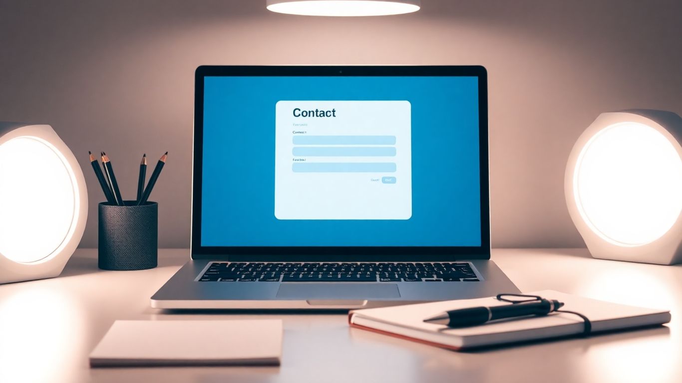
Leveraging Contact Forms and Call-to-Actions
Contact forms are super handy because they can gather specific information upfront. But don’t just slap a generic "Submit" button on there. Make your call-to-action clear and inviting. Instead of "Submit," try something like "Send Your Message" or "Let’s Connect." This makes the process feel more personal. Keep the form fields to a minimum – just the basics like name, email, and message are usually enough. If you need more info, consider adding a dropdown menu to help categorize the inquiry.
A well-designed contact form isn’t just a data collection tool; it’s the first step in building a relationship with your audience. Make it easy, make it clear, and make it inviting.
Integrating Social Media and Support Resources
People connect in different ways these days. Including links to your social media profiles gives folks another avenue to reach out or just learn more about you. Also, think about self-service options. A link to an FAQ page or a knowledge base can answer common questions quickly, freeing up your team for more complex issues. This shows you’re prepared and want to help people find answers efficiently.
Best Practices for Contact Info Samples
Making it easy for people to get in touch is a big deal. When your contact info is clear and well-organized, it shows you care about your customers’ experience. It’s not just about having a form; it’s about building trust and making sure people can reach you without a headache.
Setting Clear Expectations for Response Times
Nobody likes waiting around wondering when, or if, they’ll get a reply. Being upfront about how long it might take to hear back is super important. This manages expectations and can stop people from getting frustrated. Think about it: if you know you’ll get a response within 24 hours, you’re less likely to feel ignored.
- General Inquiries: Aim for a response within 1-2 business days.
- Support Tickets: Set a target of 4-8 business hours.
- Sales Questions: Respond within 1 business day.
Clearly stating your typical response times on your contact page or in an auto-reply message can significantly improve customer satisfaction. It shows you respect their time and have a system in place.
Organizing Options by Inquiry Type
People reach out for all sorts of reasons – maybe they have a question about a product, need technical help, or want to discuss a partnership. If you just have one generic email address, their message might get lost or sent to the wrong person. It’s way better to guide them to the right place from the start. This helps your team handle things faster and more accurately. For example, a hotel might have separate contacts for reservations, events, and general guest services. This way, the right department gets the message immediately, speeding up the whole process. You can find some great examples of this in retail and e-commerce contact pages.
Showcasing Personality and Brand Voice
Your contact page isn’t just a functional necessity; it’s another chance to connect with your audience. Let your brand’s personality shine through! Instead of stiff, corporate language, try something more approachable. A friendly greeting or a touch of humor can make a big difference. It makes your business feel more human and relatable. Think about the tone you use in other marketing materials – keep it consistent here too. This helps build a stronger connection with visitors and makes them feel more comfortable reaching out.
Industry-Specific Contact Info Sample Examples
Retail and E-commerce Contact Samples
For online stores, quick customer service is key. Think about Ulta Beauty’s approach: they put self-service options like FAQs front and center. If you still need help, they offer multiple ways to connect, including text, which is super handy when you’re on the go. Quince also does a good job of making it easy to find help, often with clear links to support or order-related questions right on their product pages or within the customer account area. The goal here is to resolve common issues fast, so customers can get back to shopping.
- Self-Service First: FAQs, order tracking, return portals.
- Multiple Channels: Email, phone, live chat, and sometimes even SMS.
- Clear Hours: Especially important for phone support.
Finance and Agency Contact Samples
When dealing with sensitive information or complex services, trust and clear communication are everything. Financial institutions might offer secure messaging portals alongside phone numbers and branch locators. Agencies, on the other hand, often highlight their portfolio and team, with contact forms that might ask for project details upfront to help them understand your needs better. They want to make sure you’re a good fit and that they can provide the right service.
For finance and agency sites, the contact page isn’t just about getting in touch; it’s about building confidence and showing you’re a reliable partner.
- Secure Options: Encrypted forms or client portals.
- Department Routing: Directing inquiries to sales, support, or specific teams.
- Project-Specific Forms: Gathering details for quotes or consultations.
Creative and Service-Based Contact Samples
Creative businesses and service providers often use their contact page to show off their personality. A graphic designer might have a quirky form or a fun illustration. A consultant might include a short video introducing themselves. The idea is to make the initial interaction feel personal and reflective of the brand. They might also offer consultations or discovery calls as a primary way to connect.
- Brand Personality: Unique design, tone, and visuals.
- Consultation Focus: Easy booking for initial meetings.
- Portfolio Links: Connecting contact with past work.
Designing a User-Centric Contact Page
When folks land on your contact page, they’re usually looking for something specific. Making it easy for them to find what they need is the whole point of a user-centric design. Think about it like setting up a helpful information desk instead of a maze. The goal is to reduce friction and make the interaction as smooth as possible.
Creating a Welcoming Introduction
Start with a friendly greeting. A short, clear sentence or two can set a positive tone. Something like, "We’re here to help!" or "Got a question? Let us know." This little bit of warmth can make a big difference. It shows you’re approachable and ready to assist. You can also briefly mention the best ways to get in touch, guiding users right away.
Simplifying Form Fields
Nobody likes filling out long forms. Keep it short and sweet. Only ask for the absolute must-haves: name, email, and a message box. If you need more specific info, consider using dropdowns or checkboxes. This makes it faster for the user and helps you organize the incoming requests. Remember, every extra field is a potential reason someone might click away. A well-designed form is key to getting useful contact information .
Here’s a quick look at what to include:
- Name: Essential for personalization.
- Email Address: For sending replies and confirmations.
- Message: The core of their inquiry.
- Optional: Phone number (if you plan to call back) or a dropdown for inquiry type.
Utilizing Visual Engagement
Visuals can make a contact page less intimidating. Think about using icons to represent different contact methods – a phone icon for the number, an envelope for email. If you have a physical location, an embedded map can be super helpful. Just don’t go overboard with flashy animations or too many images; the focus should remain on clear communication. Sometimes, a simple, clean layout with good use of white space is the most engaging approach. It helps users focus on the task at hand without distraction.
Building Trust with Your Contact Info Sample
Making it easy for people to get in touch is one thing, but making them trust you enough to actually do it? That’s a whole other ballgame. A contact page that feels solid and reliable can really make a difference in how people see your business. It shows you’re legit and that you’re not hiding anything.
Incorporating Social Proof
Think about it: when you’re looking at a new service or product, you probably want to know if other people have had good experiences, right? That’s where social proof comes in. Adding a quick testimonial or a quote from a happy client right on your contact page can go a long way. It’s like a little nod that says, "Hey, we’ve got this, and people like us."
- Display a short, impactful quote from a satisfied customer.
- Include logos of well-known clients or partners if applicable.
- Mention any awards or recognitions your business has received.
Providing Location Details When Necessary
If your business has a physical spot where people can visit, or if you meet clients face-to-face, putting that info out there is super important. It makes you seem more real and accessible. Don’t just drop a pin on a map; give people the full picture.
- Full street address: Make sure it’s easy to find and copy.
- Operating hours: Clearly state when you’re open for business or appointments.
- Embedded map: A visual guide helps people find you without fuss. This is especially helpful for local businesses looking to attract nearby customers .
Automating Confirmation Messages
So, someone took the time to fill out your form or send you an email. The least you can do is let them know it got to you! An automated confirmation message is a small touch that makes a big difference. It tells them you’ve received their message and gives them an idea of what happens next.
A quick, friendly confirmation message reassures visitors that their inquiry is in good hands. It sets the stage for a positive interaction and manages expectations about follow-up.
Here’s what a good confirmation might include:
- A simple "Thanks for reaching out!"
- An estimated response time (e.g., "We’ll get back to you within 24 business hours.")
- Links to helpful resources like an FAQ page or relevant blog posts, in case they need an answer sooner.
Wrapping It Up
So, we’ve looked at a bunch of ways to make your contact page work better. It’s not just about slapping an email address on there and calling it a day. Think about what your customers actually need when they reach out. Make it easy for them to find what they’re looking for, whether that’s a quick answer in an FAQ or a direct line to the right person. A good contact page builds trust and shows you actually care about helping people. It’s a small part of your site, sure, but it can make a big difference in how people see your business. Give it some thought, try out some of these ideas, and see how it goes.
Frequently Asked Questions
Why is having a good contact page important?
A good contact page is like a helpful signpost for your customers. When they need help or want to ask something, it’s the first place they’ll look. Making it easy to find and use shows you care about them and can even help solve problems faster, making them happier with your business.
What are the most important things to put on a contact page?
You should definitely include ways to get in touch, like a phone number and an email address. A contact form is also super helpful. It’s also a good idea to add links to your social media pages and any help guides or FAQs you might have.
Should I use a contact form or just give my email?
Using both is often the best approach! A contact form helps you get specific information from people and keeps your inbox organized. But having an email address available gives people another easy way to reach out if they prefer, or if they have a quick question.
How can I make my contact page look trustworthy?
You can build trust by showing real customer comments or reviews. If you have a physical store or office, adding your address and a map helps a lot. Also, sending a quick email back to confirm you got their message makes people feel more secure.
What’s the best way to organize contact options?
Think about why people might be contacting you. If you have different departments, like sales and support, it’s smart to give them separate email addresses or form options. This helps their questions get to the right people faster.
Does my contact page need to look fancy?
Not necessarily! While a nice design helps, the most important thing is that it’s clear, easy to use, and works well on phones. People need to find what they’re looking for quickly. A simple, clean page that’s easy to navigate is often better than a complicated one.