Mastering Accordion Web Design: Best Practices for Engaging User Interfaces
- Date
You know, sometimes websites can feel like a cluttered mess, right? Like you’re trying to find one specific piece of info, but it’s buried under a mountain of text. That’s where accordion web design comes in handy. It’s basically a way to organize content so you can expand and collapse sections, keeping things neat and tidy. We’ll break down how to use them right, what to avoid, and show off some cool examples.
Key Takeaways
- Accordions are great for saving space and organizing content, especially on mobile, but only if users don’t need to see everything all at once.
- Clear, simple labels and intuitive icons are super important so people know what they’re clicking on.
- Always think about accessibility – make sure everyone, including those using screen readers or keyboards, can use your accordions.
- Smooth animations make the experience feel better, but don’t go overboard; around 300ms with an ease-in-out effect is usually good.
- Test your accordions with tools like WebAIM and Axe DevTools to catch any issues before your users do.
1. Understanding Accordion UX
Accordions are a pretty common sight on websites these days, and for good reason. They’re basically a way to organize a lot of information without making your page look like a giant wall of text. Think of it like a digital filing cabinet; you’ve got your main folders, and when you need something specific, you just open up the right one. This pattern lets users expand and collapse sections, showing or hiding content as they need it. It’s a neat trick for keeping interfaces tidy and making it easier for people to find what they’re looking for.
What is Accordion UX?
At its heart, accordion UX is all about managing content efficiently. You have a list of items, usually with a title, and when you click on a title, the content associated with it expands. Click it again, and it collapses. It’s a lot like how a musical accordion works, with different sections opening and closing. This interaction helps users focus on one piece of information at a time, reducing clutter and making complex topics feel more approachable. It’s a smart way to handle information that might otherwise overwhelm visitors.
Common Uses of Accordion UX
So, where do you usually see these things? FAQs are a big one, obviously. If you’ve got a lot of questions and answers, an accordion keeps them organized and easy to scan. They’re also great for forms that have a lot of fields, or for navigation menus, especially on smaller screens where space is tight. Basically, anywhere you have a good amount of content that can be broken down into distinct sections, an accordion can be a good fit. They really shine on mobile devices because they help save screen real estate. You can see how they help manage content on mobile websites .
Types of Accordion Layouts
Not all accordions are created equal, though. There are a few main ways they can work:
- Single Open: This is where only one section can be expanded at a time. If you open a new one, the previous one automatically closes. This is super common for FAQs because it keeps the focus tight.
- Multi-Open: With this type, users can open as many sections as they want, all at the same time. This is handy if someone needs to compare information from different sections.
- Nested: This is when you have accordions inside other accordions. It’s for when you have really complex, layered information that needs to be broken down even further.
Understanding these different types helps you pick the right one for your specific content and user needs. It’s not just about making things look pretty; it’s about making them work better for the people using them. Choosing the right accordion layout can make a big difference in how users interact with your site.
2. Common Uses of Accordion UX
Accordions are super handy for organizing stuff on a webpage, especially when you’ve got a lot of information to share but don’t want to make the page look like a giant wall of text. They’re like a digital filing cabinet, letting users open up sections they’re interested in and keep the rest neatly tucked away. This really helps keep things tidy, particularly on smaller screens like phones where space is always a bit tight.
Think about it, accordions are used all over the place. They’re a go-to for FAQ sections, making it easy for people to find answers without scrolling through endless questions. You’ll also see them in forms, breaking down complex input fields into manageable chunks. Even navigation menus can use accordions to hide sub-items, keeping the main menu clean and uncluttered. It’s all about making it easier for users to find what they need without feeling overwhelmed. The goal is always to simplify the user’s journey.
Here are some common places you’ll find accordions working their magic:
- Frequently Asked Questions (FAQs): This is probably the most popular use. Instead of one long page of questions and answers, each question becomes a clickable header, and the answer only appears when clicked. This makes scanning for specific information a breeze.
- Forms and Settings: For longer forms or complex settings panels, accordions can break down the content into logical groups. This prevents users from being faced with a dauntingly long form all at once.
- Product Information: On e-commerce sites, accordions can display product details, specifications, reviews, and shipping information without cluttering the main product page.
- Navigation Menus: Especially on mobile or in applications, accordions can hide secondary navigation links, keeping the primary menu clean and focused.
- Content-Heavy Pages: If you have a page with a lot of distinct sections, like a detailed guide or a company overview, accordions can help users jump to the parts they care about most. This is great for improving content engagement .
Using accordions effectively means understanding that not all content is meant to be hidden. It’s about presenting information in a way that’s organized and accessible, reducing cognitive load for the user.
3. Types of Accordion Layouts
Accordions aren’t a one-size-fits-all deal. The way you structure them really changes how users interact with your content. Think about it: sometimes you want users to focus on just one thing at a time, and other times, they might need to compare a few different options side-by-side. That’s where different accordion layouts come into play.
Single Open Accordions
These are pretty common, especially for FAQs. The main idea here is that only one section can be expanded at any given moment. So, if you click to open a new section, the one that was previously open automatically closes. This keeps things tidy and helps users focus on a single piece of information without getting distracted by too much open content. It’s like a digital filing cabinet where only one drawer is ever pulled out.
Multi-Open Accordions
Now, these give users a bit more freedom. With a multi-open accordion, you can have several sections expanded at the same time. This is super handy when users might need to look at or compare different pieces of information concurrently. Imagine filling out a complex form or adjusting a bunch of settings; being able to keep multiple relevant sections open makes the process much smoother. It’s all about giving users the flexibility they need for their specific task.
Nested Accordions
This is where things get a little more intricate. Nested accordions involve placing an accordion inside another accordion. You’d typically use this for really complex or hierarchical information. Think of a large knowledge base or a detailed settings menu. By nesting, you can break down vast amounts of information into smaller, more manageable chunks without making the user jump between different pages. It helps maintain context and keeps the interface from feeling too overwhelming, even with a lot of content. It’s a way to organize information in layers, making it easier to digest.
The choice of accordion layout significantly impacts user experience. A single-open design promotes focus, while multi-open and nested structures offer flexibility for more complex information architectures. Selecting the right type depends entirely on the user’s goals and the nature of the content being presented. It’s about matching the tool to the job.
4. When to Use an Accordion
Think of an accordion UI like a well-organized filing cabinet. It’s fantastic for keeping lots of information tidy and accessible without making your page look like a cluttered mess. You really want to reach for this design pattern when users don’t need to see everything all at once. It’s perfect for breaking down content into distinct, logical chunks. This is especially true if you’re designing for smaller screens, like on a mobile phone, where saving space is a big deal. Accordions help keep your interface clean and make it easier for people to find what they’re looking for without getting overwhelmed.
Here are some prime situations where an accordion really shines:
- Frequently Asked Questions (FAQs): Users typically look for one specific answer at a time. An accordion lets them expand just the question they need answered.
- Settings or Preferences Menus: When you have a lot of options, grouping them into collapsible sections makes the interface much less intimidating.
- Product Feature Lists: If a product has many features, you can use an accordion to detail each one without making the initial product page too long.
- Long Articles or Guides: Breaking down a lengthy piece of content into sections that users can expand as needed can improve readability and engagement.
Using an accordion is all about managing complexity. It’s a way to present a lot of information without forcing the user to confront it all simultaneously. The goal is to make finding specific details straightforward and efficient, especially when screen real estate is limited. A good accordion feels like a helpful tool, not a barrier.
For instance, if you have a page detailing different service plans, an accordion can neatly tuck away the specifics of each plan, allowing users to compare them easily without endless scrolling. This approach helps maintain a clean look and feel, which is great for user experience, especially when you’re trying to present detailed information without overwhelming the visitor. You can see how this might be applied in e-commerce email marketing, where clear calls to action are key in a simple layout .
5. When Not to Use an Accordion
Accordions are super handy for organizing stuff, but they aren’t a magic fix for every situation. Sometimes, forcing content into an accordion just makes things harder for people trying to use your site. If your users actually need to see most of the information all at once, an accordion can actually slow them down. Imagine having to click open five different sections just to compare a couple of things – that’s just extra work nobody asked for.
Avoid Accordions When Content Needs Constant Visibility
If your users regularly need to view all the content sections simultaneously to complete a task or make a decision, an accordion pattern is probably not the best choice. It adds unnecessary steps and can lead to frustration. Think about a comparison table or a detailed product specification sheet where all details are important at a glance. Hiding these details behind clicks just makes the user experience worse.
Avoid Accordions When They Hinder Navigation
Sometimes, the goal of an accordion is to simplify navigation, but if it ends up making it more complicated, it’s a sign you should reconsider. If users find themselves constantly opening and closing sections just to find what they need, the accordion is working against you. This is especially true if the content is highly interconnected and users need to jump between sections frequently. A well-structured list or a different layout might be a better fit here. For instance, if you’re presenting a series of related steps, a linear flow or a simple list might be more intuitive than an accordion that requires constant expansion and collapse.
Avoid Accordions When They Slow Down Scanning
People often use accordions to save space, but if the content within each section is something users need to scan quickly, hiding it can be a problem. If the primary interaction is reading and comparing information across multiple sections, an accordion can create a bottleneck. Instead of a quick scan, users are forced into a series of clicks. This is where a more open layout, perhaps a simple list or a grid, would allow users to process information much faster. You want to make it easy for users to find what they need, not make them work for it. Improving your site’s mobile responsiveness is key for all users, but especially when they’re on the go and need information quickly.
If an accordion forces users to click more than they would have to with a standard layout, it’s probably not the right tool for the job. The goal is always to reduce friction, not add it.
6. Best Practices for Designing Accordions
So, you’ve decided an accordion is the right tool for the job. Great! But how do you make sure it actually helps people and doesn’t just become another thing they have to click through? It’s all about thoughtful design. Making accordions user-friendly means paying attention to the little details.
First off, labels. They need to be super clear. Nobody should have to guess what’s behind that little arrow. Think about what the user is trying to find and label it accordingly. If it’s a question, phrase it like a question. If it’s a category, make it a clear category name. It sounds obvious, but you’d be surprised how often this gets messed up.
Then there are icons. A simple down arrow usually means "expand," and an up arrow means "collapse." Keep it consistent. This visual cue is a big part of making the interaction feel natural. We want users to know what to expect before they even click.
Give people control over their experience. Sometimes, users might want to open more than one section at a time. If your accordion design forces one section to close when another opens, make that behavior really obvious. Or, better yet, consider if that’s really necessary for your content. Allowing multiple sections to be open can be a real time-saver for some users.
Think about what content is most important. Maybe a key piece of information should be expanded by default? This way, users don’t miss out on something vital just because they didn’t click the right header. It’s about guiding them to the good stuff without being pushy.
For longer accordions, an "Expand All" or "Collapse All" button is a lifesaver. It cuts down on a lot of repetitive clicking, especially if someone needs to quickly scan all the information. It’s a small addition that can make a big difference in how usable your interface feels.
And please, use smooth animations. We’re not talking about flashy, distracting effects here. Just a gentle transition, maybe around 300 milliseconds with an ease-in-out timing, makes the content feel like it’s actually moving and appearing, rather than just popping into existence. It makes the whole experience feel more polished and less jarring. It’s about creating a good user experience, which is vital for website success.
Finally, always keep mobile and accessibility in mind. This means making sure tap targets are big enough for fingers on a phone, and that the accordion works correctly with screen readers and keyboard navigation. Designing for everyone is just good design.
7. Clear, Concise Labels
When you’re building an accordion, the words you use for each section’s title are super important. Think of them as the signposts for your content. If they’re confusing or too long, people will just get frustrated and click away. You want users to know exactly what they’re going to get before they even click. It’s like labeling drawers in a kitchen – if you label one "Stuff," you’re not really helping anyone find the spatulas.
So, what makes a good label? It’s all about being direct and to the point. Avoid jargon or overly technical terms that only a few people will understand. Keep it short, but descriptive enough so there’s no guesswork involved. For instance, instead of "Information Regarding Product Specifications," try "Product Specs." It’s much easier to scan and understand quickly.
Here’s a quick rundown of what to aim for:
- Be Specific: "Payment Options" is better than "Billing."
- Be Brief: Shorter is usually better, as long as it’s clear.
- Use Familiar Language: Stick to words your audience uses every day.
Making your labels crystal clear is one of the simplest ways to improve how people use your website. It cuts down on confusion and makes finding information a breeze. This practice enhances user experience by making navigation intuitive and content easily digestible. It’s a small detail that makes a big difference in how effective your interface is.
Think about how you’d want to find information. You wouldn’t want to click through a bunch of vague headings, right? Giving users clear, concise labels for accordion headings means they can quickly scan and find what they need without having to guess what’s inside accordion labels must be clear and concise . This makes the whole experience smoother and less of a chore.
8. Intuitive Icons
Icons are like the shorthand of web design. They help users get what they need without having to read a ton of text. When you’re using accordions, icons can really make a difference in how easy it is for people to use your interface. Think about it – a little plus sign next to a heading tells you, ‘Hey, you can click this to see more.’ And a minus sign? That means it’s already open. It’s pretty straightforward.
The goal is to pick icons that are instantly recognizable and fit with the overall look of your site. You don’t want users scratching their heads trying to figure out what a weird symbol means. It’s all about making things clear and simple. If an icon isn’t super obvious, it’s a good idea to add a text label or a tooltip. This way, no one gets confused, and you avoid any guesswork. It’s a small step that can really improve the user experience, especially when you’re dealing with a lot of information packed into an accordion.
Here are a few things to keep in mind when choosing icons for your accordions:
- Consistency is key: Use the same style of icons throughout your entire website. If you have one kind of icon for expanding and collapsing in your accordion, use similar ones elsewhere for similar actions.
- Familiarity breeds understanding: Stick to icons that people already know. Think of the common symbols for things like search, settings, or a house. Using these familiar icons makes your interface feel more intuitive.
- Size matters: Make sure your icons look good and are readable at different sizes. They need to be clear on a big desktop screen and still easy to see on a small phone.
- Context is everything: The icon should make sense with the text it’s paired with. A vague icon next to a clear label is better than a vague icon with no label at all.
Using icons effectively in accordions is about more than just decoration; it’s about improving usability. They act as visual cues, helping users quickly understand the function of each collapsible section. When icons are well-chosen and consistently applied, they contribute to a more efficient and pleasant interaction with your content. It’s a subtle but powerful way to guide users through complex information structures.
For example, using a simple plus (+) icon for closed sections and a minus (-) icon for open sections is a widely understood convention. This visual language helps users immediately grasp the state of each accordion item. If you’re looking to improve your website’s overall user experience, consider how small elements like icons can make a big impact. You can find great resources on UI design principles to help guide your choices.
9. User Control
When you’re building an accordion, it’s all about giving the user the reins. They should feel in charge of what they see and when they see it. This means making sure every clickable part of your accordion is super obvious and easy to use. Think about it: if someone clicks on a section header, they expect that section to open up, right? So, the interaction needs to be predictable and straightforward.
Predictable Interactions
Users generally expect accordions to work in a specific way. When they click a header, the content below should expand or collapse. It’s a simple interaction, but sticking to this convention makes your interface feel familiar and trustworthy. Avoid surprising users with unexpected behaviors; consistency is key here. If a click doesn’t do what they expect, they might get frustrated and look elsewhere.
Clear Visual Cues
Make it really clear which sections are currently open and which are closed. This can be done with simple visual changes. Maybe the header color shifts slightly, or an icon changes direction. For example, an arrow pointing down could indicate an open section, while an arrow pointing right means it’s closed. These little cues help users quickly scan the accordion and understand its state without having to read every single label.
Grouping Related Content
It makes sense to group similar information together within an accordion. If you have a bunch of FAQs, for instance, you wouldn’t want to mix a question about shipping with one about returns in the same section. Organizing content logically helps users find what they’re looking for faster. Think about how you’d sort things in your own life – you put socks with socks, not with tools. The same principle applies here. Grouping related options together makes the whole thing less overwhelming.
User Control Over State
Beyond just opening and closing, consider giving users control over the accordion’s overall state. Sometimes, having an "Expand All" or "Collapse All" button can be a real time-saver, especially if the accordion has many sections. This lets users quickly get a broad overview or tidy everything up with a single click. It’s a small feature, but it really adds to the feeling of control. You can find more on this in our section about accordion UI examples .
10. Highlighting Essential Content
When you’re building out an accordion, it’s super important to think about what information people are actually looking for. You don’t want them digging through a bunch of stuff to find the main point, right? The goal is to make the most important content immediately obvious and accessible.
Think about it like this: if someone clicks on a section, they probably want the answer or the key detail right away. So, how do you make that happen?
- Prioritize Key Information: Put the most critical details at the top of each accordion panel. If it’s a product feature, list the main benefit first.
- Use Clear Headings: The title of each accordion section should give a strong hint about the content inside. No vague titles allowed!
- Visual Cues: Sometimes, a little bold text or a slightly larger font size for the main point within a panel can help draw the eye.
It’s all about making it easy for users to scan and find what they need without getting lost. You want them to feel like they’ve found the answer quickly, not like they’ve just opened a digital filing cabinet.
Making the most important stuff stand out means users don’t have to hunt for it. This saves them time and makes your interface feel much more helpful.
For example, if you have an accordion for product specifications, the core specs like dimensions or weight should be right there, not buried under three other sub-points. This kind of thoughtful organization really helps improve the overall user experience, making it easier for people to get the information they need. It’s a big part of making your website perform better, especially for things like e-commerce sites where quick information can lead to sales. You can find more on how to enhance your website’s performance .
- Keep Panels Focused: Each accordion panel should ideally cover one main topic or question. Don’t cram too much unrelated information into a single section.
- Consider Default Expansion: For very common questions or critical information, you might even consider having that section expanded by default, though use this sparingly.
11. Expand All/Collapse All Button
Sometimes, you just want to see everything at once, right? That’s where the "Expand All/Collapse All" button comes in handy. It’s a real time-saver, especially when you’re dealing with a lot of information packed into an accordion.
Think about it: if you have a long FAQ section or a list of settings, clicking each one individually can get pretty tedious. A simple button that opens or closes all the sections at once makes the whole experience much smoother. It gives users more control over how they interact with the content.
- Saves Time: Users don’t have to click through each section individually.
- Improves Usability: Especially helpful for lengthy accordions or when users need a broad overview.
- Offers Control: Lets users decide if they want to see everything or just specific parts.
When you implement this feature, make sure it’s clearly visible and easy to understand. A simple icon or a straightforward label like "Expand All" or "Collapse All" works best. It’s a small addition that can make a big difference in how people use your interface, making it easier to get the information you need .
12. Smooth Animations
Animations can really make an accordion feel alive, you know? Instead of just snapping open and shut, a little bit of movement makes the whole interface feel more polished and less jarring. Think about it – when a section expands, a smooth transition makes it feel like the content is actually appearing, not just suddenly there. It’s all about making the user experience feel natural.
The sweet spot for accordion animations is usually around 300 milliseconds. Too fast, and it feels abrupt. Too slow, and people get impatient waiting for things to load. A nice ease-in-out timing function also helps, making the start and end of the animation feel gentle. It’s like a little visual cue that tells the user, "Yep, something just happened here."
Here are a few things to keep in mind with animations:
- Keep it subtle: The animation should support the content, not steal the show. Overly flashy animations can be distracting.
- Consistency is key: Use similar animation styles across your whole site. If one accordion slides down and another fades in, it can feel a bit messy.
- Consider performance: While animations are great, don’t go overboard. Complex animations can slow down older devices or slower internet connections.
It’s also worth checking out some CSS slider examples to get a feel for how different transition effects can be achieved without needing a lot of code. Sometimes, the simplest animations are the most effective. You want the interaction to feel responsive and intuitive, and that’s where well-timed animations really shine. They help guide the user’s eye and confirm their actions without them even really thinking about it. It’s a small detail, but it makes a big difference in how polished the overall design feels. You can find some great examples of clean code and fluid animations online that can give you ideas for your own projects. Explore CSS slider examples .
Animations in accordions aren’t just about looking pretty; they’re about guiding the user’s attention and providing clear feedback. A well-executed animation makes the interaction feel more intuitive and less like a clunky piece of software. It’s about creating a flow that feels right.
13. Mobile and Accessibility Design
When you’re thinking about how your accordion design works on phones and for people with disabilities, it’s pretty important. You want everyone to be able to use it easily, no matter their device or how they interact with the web.
On mobile, space is tight. Accordions are great for saving screen real estate, but you have to make sure the titles are easy to tap and the content doesn’t get cut off weirdly. Think about how much space each expanded section takes up. Maybe you only want one section open at a time on smaller screens, or perhaps the titles need to be a bit bigger. It’s all about making sure the user doesn’t have to do a ton of zooming or scrolling just to read something.
For accessibility, it’s a whole other ballgame, but just as vital. Screen readers need to understand what’s clickable and what content it reveals. Using the right ARIA attributes, like aria-controls , helps connect the button that opens a section to the content panel itself. This way, a screen reader can announce, "This button expands to show more information." Also, make sure there’s a clear visual indicator when something is selected or active, so keyboard users can easily see where they are. It’s about making sure the interaction is understandable for everyone.
Here are a few things to keep in mind:
- Tap Targets: Make sure the buttons to open and close sections are large enough to tap easily on a touchscreen. No more accidentally opening the wrong thing!
- Focus Indicators: When someone is tabbing through your accordion using a keyboard, there needs to be a clear visual cue showing which section is currently selected. This helps them know where they are.
- Content Order: Think about the order of your accordion sections. Does it make sense logically? For screen reader users, the order in which content is read aloud matters a lot. You can check out some best practices for accessible components to get a better idea.
Designing with both mobile users and accessibility in mind from the start means you avoid a lot of headaches later on. It’s not just about ticking boxes; it’s about creating a genuinely usable experience for more people. You don’t want to exclude anyone just because the design wasn’t thought through for different situations.
Remember, a good accordion design is one that works well for the majority of your users, and that includes those on mobile devices and those who rely on assistive technologies.
14. Ensuring Accessibility
Making sure everyone can use your accordions is a big deal. It’s not just about looking good; it’s about being usable for all people, no matter their abilities. This means thinking about screen readers, keyboard navigation, and making sure the content is understandable even without visual cues.
Keyboard Navigation
People who can’t use a mouse often rely on their keyboard to get around a website. Your accordions need to work with this. Users should be able to tab through the accordion headers, press Enter or Space to open and close them, and then tab to the content inside. It should feel natural, not like a puzzle. Every interactive element should be reachable and operable via keyboard.
Screen Reader Compatibility
Screen readers are used by people who are blind or have low vision. They read out the content on the screen. For accordions, this means using the right code so the screen reader knows what’s what. This involves using ARIA (Accessible Rich Internet Applications) attributes. These attributes tell the screen reader that a header controls a content panel, whether that panel is open or closed, and how to interact with it. It’s like giving the screen reader a map of your accordion.
Clear Visual Focus Indicators
When someone is using a keyboard, they need to see where they are on the page. This is called the focus indicator. When a user tabs to an accordion header, it should get a clear visual highlight, like a colored outline. This helps them know which header is currently selected and ready to be opened or closed. Without this, it’s really hard to know where you are.
Semantic HTML Structure
Using the right HTML tags is the first step to good accessibility. For accordions, this means using heading tags ( <h2> , <h3> , etc.) for the titles and then the content within a <div> or similar element. This structure helps assistive technologies understand the relationship between the headers and the content they control. It’s about building a solid foundation for your content.
Testing with Assistive Technologies
Don’t just guess if your accordions are accessible. You need to test them. Try using a keyboard to navigate through them. If you can, use a screen reader like NVDA or JAWS to hear how it sounds. There are also online tools that can check for common accessibility problems. Getting feedback from actual users with disabilities is even better. You can find some helpful resources on how to build accessible accordions at web accessibility .
Making accordions accessible isn’t an afterthought; it’s a core part of good design. It means thinking about everyone from the start, using the right code, and testing thoroughly. This way, your content is not only engaging but also usable by the widest possible audience.
15. Balancing Content Visibility
Balancing Content Visibility
When you’re using accordions, you’ve got to think about what people can see right away versus what’s tucked away. It’s like a balancing act, really. You want to show enough to get people interested, but not so much that the page feels cluttered. The goal is to make sure the most important stuff is easy to spot without needing to click anything.
Think about it: if someone lands on your page and can’t immediately grasp what you’re offering, they might just leave. But if you put everything out there upfront, the page can look overwhelming. Accordions help with this by letting you hide details. However, you still need to make sure the headings for each section are super clear. They’re like signposts telling people what they’ll find if they click.
Here’s a quick rundown of how to get this right:
- Prioritize Key Information: Put the most critical details in the visible part of the accordion, or even better, outside of it entirely. This way, search engines can easily find it, and users get the gist quickly. You can check out how to optimize content for SEO to get a better idea.
- Clear Headings: Each accordion header needs to be descriptive. If a user sees "Product Features" and then "Specifications," they know what to expect.
- Visual Cues: Use icons or subtle styling to show which sections are open and which are closed. This helps users understand the state of the accordion at a glance.
It’s easy to get carried away with hiding content, but remember that users need to be able to scan and understand your page’s purpose quickly. Accordions are great for organizing, but they shouldn’t be used to bury important information so deep that no one finds it.
For example, on a product page, you might have the product name and price visible, with details like "Shipping Information" or "Customer Reviews" in expandable sections. This way, the core info is right there, and users can dig deeper if they want to. It’s all about giving users control and making the information accessible without making the page too busy.
16. Optimizing for Mobile Devices
When you’re thinking about accordions, especially for a website that people will visit on their phones, you really need to get this right. Mobile-first design isn’t just a buzzword anymore; it’s how search engines like Google rank sites. Since most people are browsing on smaller screens, your accordion needs to work perfectly there. This means making sure the text is easy to read and the buttons to expand or collapse content are big enough to tap without accidentally hitting something else. It’s all about making it simple for someone on the go to find what they need quickly.
Responsive Design is Key
Your accordion layout needs to be flexible . It should automatically adjust to fit whatever screen size it’s being viewed on. This is called responsive design. Think about how a newspaper article looks different on a big page versus a small phone screen – it rearranges itself. Your accordion should do the same. This helps keep your pages looking clean and prevents users from having to do a lot of zooming and scrolling.
Touch-Friendly Interactions
On a phone, you’re using your finger, not a mouse. So, the clickable areas for your accordion items need to be a decent size. Nobody likes trying to tap a tiny little header and missing it. Make sure there’s enough space between the accordion items so users can easily tap the one they want without accidentally opening another. This makes the whole experience feel much smoother.
Content Prioritization
With limited screen space on mobile, you can’t show everything at once. Accordions are great for this because they let you hide content until it’s needed. Think about what information is most important for someone to see right away. Put that at the top, and then use the accordion to tuck away the less critical details. This way, users can get the main points quickly and then dig deeper if they choose.
Performance Matters
Slow loading times are a killer on mobile. If your accordion has a lot of content or large images inside, it can really slow down your page. Make sure any images are optimized for web use and that the code for your accordion is efficient. Nobody waits around for a slow page to load, especially on their phone. You can check out ways to improve site speed on Google’s developer pages .
Testing on Real Devices
Don’t just assume it looks good on your phone. Test your accordion on different types of phones and tablets. See how it behaves on different screen sizes and operating systems. What looks fine on an iPhone might be a bit wonky on an Android device. Getting feedback from actual users on their mobile devices is also super helpful.
17. Structured Data and Schema Markup
When you’re building out your accordion sections, think about how search engines see your content. Using structured data, like schema markup, can help search engines understand the information within your accordions better. This means that even though the content is hidden until a user clicks to expand it, search engines can still crawl and index it properly. This is super important for SEO, especially with how search engines are prioritizing mobile-first indexing. If your accordion content is valuable, you want it to be discoverable.
Using schema markup can help your accordion content get picked up for rich results in search. This could mean your FAQs within an accordion show up directly in search results, which is a pretty big win. It’s like giving search engines a little cheat sheet to understand what’s inside each collapsible section.
Here’s a quick rundown of why this matters:
- Improved Indexing: Search engines can crawl and index content hidden within accordions more effectively.
- Rich Results Potential: Schema markup can help your content appear in special search result features.
- Better User Experience Signals: Well-structured content, even in accordions, contributes to positive user experience signals that search engines look for.
Think of it as making your accordion content more searchable . It’s not just about how users see it on your site, but also how search engines interpret it. For example, if you have a product page with an accordion for specifications, marking that up with the right schema can help those specs get indexed. You can find more info on how to optimize your e-commerce store for mobile by focusing on user behavior and touch interactions at mobile optimization .
It’s a bit of technical detail, but getting it right means your well-organized content has a better chance of being found.
18. Monitoring and Adjusting Based on Analytics
After you’ve put your accordions into place, the work isn’t really done. You’ve got to keep an eye on how people are actually using them. Think of it like setting up a new display in a store; you want to see if customers are picking up the items or just walking past. We can use analytics tools to get a feel for this.
What are people clicking on? Are they opening up most of the sections, or just a few? How long do they stick around on the page once they’ve interacted with an accordion? These kinds of questions help us figure out if the accordion is doing its job. If, for example, a lot of users open a specific section but then leave the page quickly, maybe the content in that section isn’t quite hitting the mark. Or perhaps the transition to the next step isn’t clear.
We can also look at things like bounce rates and how much time users spend on the page. High bounce rates on pages with accordions might suggest users aren’t finding what they need, or the accordion itself is causing confusion. Conversely, if users are opening multiple sections and spending more time on the page, that’s a good sign the accordion is helping them engage with the content.
Here’s a quick look at what to track:
- Click-through rates on accordion headers.
- Expansion rates for individual sections.
- Time on page for users who interact with accordions versus those who don’t.
- Scroll depth to see how far users go into the content.
It’s not enough to just put an accordion on a page and forget about it. We need to treat it like any other part of the user experience that needs checking and tweaking. This continuous loop of checking and adjusting is how we make sure our interfaces are actually working well for people. It’s about making informed decisions based on real user behavior, not just guessing what might be best.
Based on this data, we can make changes. Maybe we need to reword the labels on the accordion headers, or perhaps rearrange the order of the sections. Sometimes, it might even mean rethinking whether an accordion is the right choice for that particular piece of content. Tools like Google Search Console can show us how search engines are seeing the content within your accordions, which is also pretty important for SEO performance . It’s all about refining the experience to make it better for both the user and the search engines.
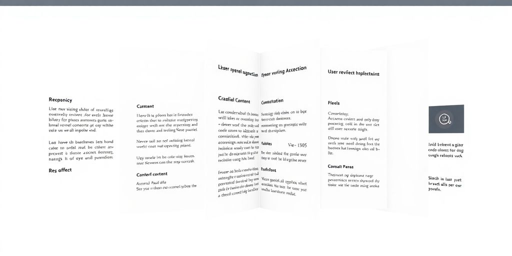
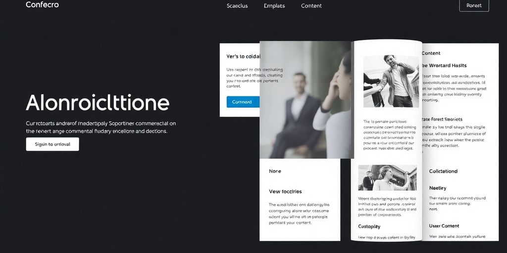
19. Accordion UI Examples
Seeing accordions in action is the best way to get a feel for how they can really work for you. It’s not just about hiding content; it’s about making it easy to find and digest. Think about how companies like Stripe use them for their support pages. They keep things super clean, with smooth transitions when you click to expand a section. It feels natural, not clunky. Apple’s support pages are another good example. They’ve got these really clear headings, so you can scan them easily and find what you need without much fuss. The way they expand is smooth too, keeping everything organized.
Then there’s Notion’s Help Center. They use what are called nested accordions, which is pretty neat for really complex topics. You click a main section, and then sub-sections appear. It keeps the interface from getting too crowded. Webflow University also does a nice job with their FAQs, using great typography to make the expandable details easy to read.
These examples show a few different ways to use accordions:
- FAQs: Great for answering common questions without taking up too much screen space.
- Navigation Menus: Like what you see in Slack’s sidebar, where you can expand categories to see more options.
- Settings Panels: As seen in Google Analytics or Asana, where you can group related settings together.
- Filtering and Sorting: Trello uses accordions to help users refine their dashboards.
It’s all about making information accessible without overwhelming the user. A well-designed accordion can really make a difference in how people interact with your site. You can find some really good pure CSS accordions online if you want to see how it’s done without any JavaScript.
The key is to make the interaction feel intuitive. Users shouldn’t have to guess how to open or close a section, and the content inside should be easy to scan once revealed. It’s a balance between saving space and providing clear access to information.
20. Tools for Testing and Optimization
So, you’ve put together a slick accordion interface. That’s great! But how do you know if it’s actually working well for people? That’s where testing and optimization tools come into play. Think of it like test-driving a car before you buy it – you want to make sure everything runs smoothly.
Accessibility Checkers
First off, accessibility is super important. You don’t want to exclude anyone. Tools like WebAIM are fantastic for spotting issues like missing ARIA roles or bad color contrast. Another great one is Axe DevTools , which really digs into WCAG compliance. Getting these right means your accordion works for everyone, including folks using screen readers.
Performance and Code Linters
Beyond accessibility, you need to make sure your accordion isn’t slowing down your site. Tools like Google Lighthouse can audit your pages for performance, accessibility, and SEO. For the code itself, JSLint or ESLint help catch JavaScript errors that could break your accordion or just make it clunky. Clean code means a better experience.
User Behavior Analytics
Want to see how people are actually using your accordions? Tools like Hotjar or Crazy Egg offer heatmaps and scroll maps. These visual tools show you where users are clicking, how far they’re scrolling, and what they might be missing. It’s like having x-ray vision into user interaction.
A/B Testing Platforms
Sometimes, you have two ideas for an accordion and can’t decide which is better. That’s what A/B testing is for. You can show version A to half your visitors and version B to the other half, then see which one performs better based on metrics like engagement or conversion. It’s a data-driven way to make design decisions.
Animation Tools
If you’re using animations to make your accordions open and close smoothly, you’ll want to test those too. Framer Motion , for example, lets you create really nice animations without bogging down your site’s speed. It’s all about making those transitions feel premium and responsive.
Wrapping It Up: Making Accordions Work for You
So, we’ve talked a lot about how accordions can be super useful for keeping websites tidy and helping people find what they need. They’re great for saving space, especially on phones, and can make even big chunks of info feel manageable. But, as we’ve seen, they can also be a pain if they’re not done right, hiding stuff users actually want to see. The key is knowing when to use them and following those simple rules: clear labels, easy icons, smooth animations, and making sure everyone can use them, no exceptions. We looked at some great examples, and with the tools and tips we shared, you’ve got a solid starting point. Now go ahead and build some accordions that actually help people out!
Frequently Asked Questions
What exactly is an accordion UI?
An accordion UI is like a digital filing cabinet. It lets you show or hide bits of information by clicking on headings. This keeps web pages neat and tidy, especially when there’s a lot of stuff to show.
Where are accordions commonly used on websites?
Accordions are super useful for frequently asked questions (FAQs), long web pages, forms, and menus. They’re especially great for phones because they save a lot of screen space.
When is it a good idea to use an accordion?
You should use an accordion when you have a lot of information that can be split into different topics, and people don’t need to see everything all at once. It’s also good when you need to save space.
When should I avoid using an accordion?
Don’t use an accordion if people need to see all the information at the same time, or if they have to click back and forth a lot to do something. This can make things more annoying instead of easier.
What are some key tips for designing good accordions?
Make sure the headings are super clear so people know what they’ll find. Use simple icons like arrows to show if something can be opened or closed. Also, make sure it’s easy to use with a keyboard and on a phone.
Can I add an ‘Open All’ or ‘Close All’ button to my accordion?
Yes, you can add a button that lets users open or close all the sections at once. This is handy for really long lists of information.